Pevco Atlas
SCOPE
App dashboard redesign
MY ROLE
UX strategy, user research, UI design
MY DELIVERABLES
Wireframes, app interface, feature upgrades, annotations
CONTRIBUTORS
Aline Lin, creative director
Misty Pacaco, junior UX designer
TOOLS
Figma
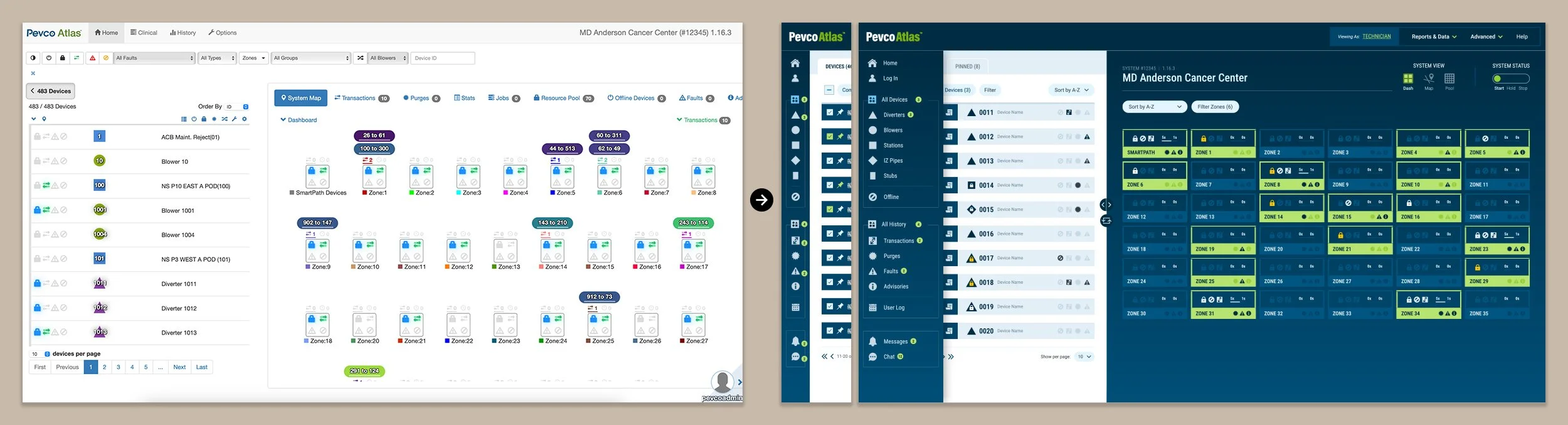
As hospital systems become expansive, they require more efficient ways of executing patient care. To rapidly transport samples and medication within the same complex, many facilities have turned to pneumatic tube systems. These pipelines use compressed air and suction to transport materials at a speed of roughly 25 feet per second, accelerating diagnosis and treatment dramatically as they eliminate the need for manual transportation. Companies like Pevco, the largest U.S.-owned pneumatic tube manufacturer, help a variety of clients with these needs, from freestanding facilities to medical centers with dozens of buildings.
System requirements for larger facilities can be physically daunting, but Pevco’s Atlas tube management software also poses a usability challenge. Technicians require substantial information to identify and repair problems, which can quickly become overwhelming for large networks with many runs of tubing. Our team was hired to audit the existing Atlas dashboard, study its functions, and suggest both design solutions and new features to improve users’ experience.
THE CHALLENGE:
Pneumatic tube systems are complex pieces of machinery, but Atlas’s dashboard interface was doing technicians no favors: their baseline repair process alone required 22 steps to execute.
To better understand Atlas, I visited the client’s headquarters to attend technician training for 2 days and observe the huge array of capabilities the dashboard offered. I quickly knew it would be impossible to radically simplify this software without losing critical functions, so consolidation and reorganization became the goal instead. I aimed to:
Reduce click paths and group related features together
Highlight key processes while minimizing less important ones
Divide content into like categories that follow common use patterns
Training showed me that there are two general types of activities technicians do: those that look at a specific piece of the system, and those that gauge the health of the system as a whole. Technicians often needed to consult both types of information at one time. I also observed that the majority of granular tasks involved either the equipment itself, or the processes that have occurred (or soon will) in the system. The information required for each of these categories was split between multiple pages, and further within multiple tabs or menus within said pages.
THE SOLUTION:
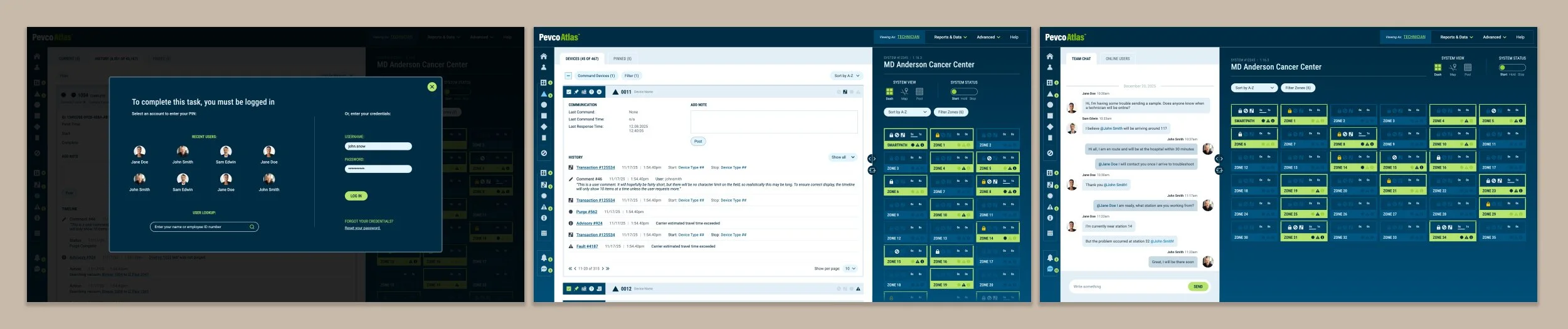
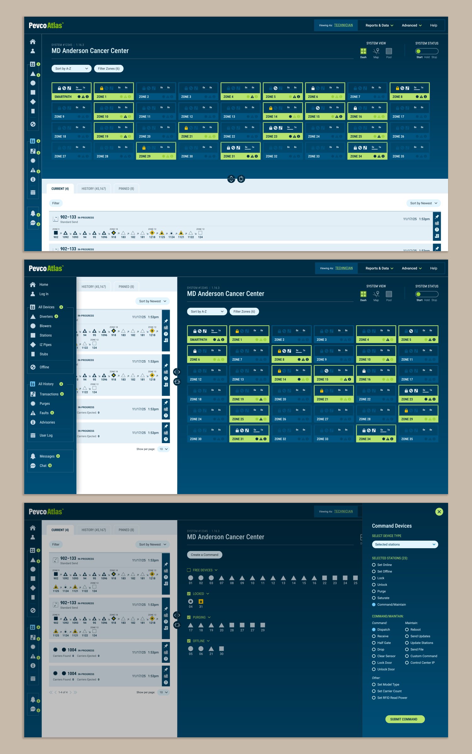
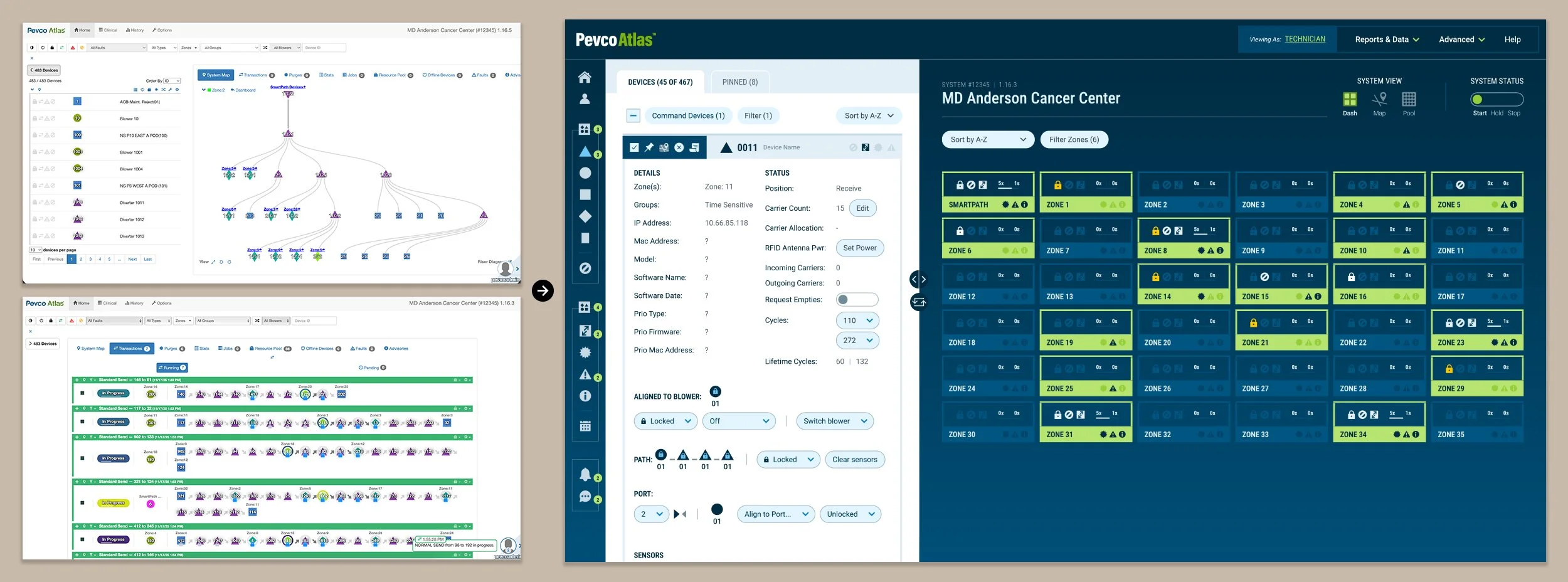
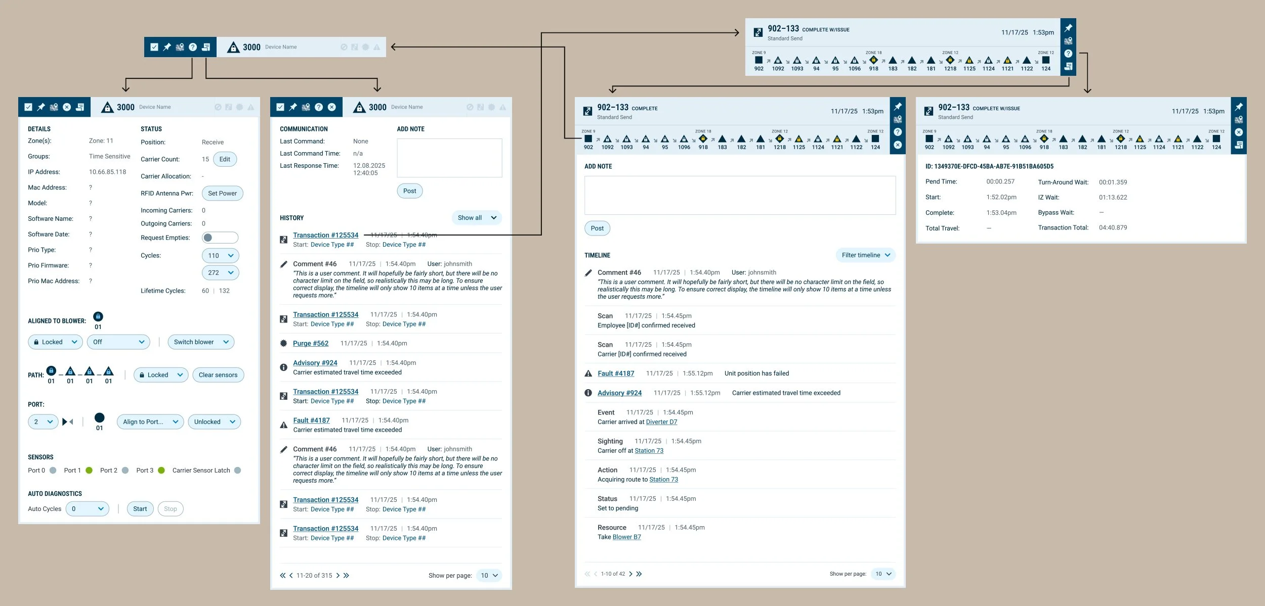
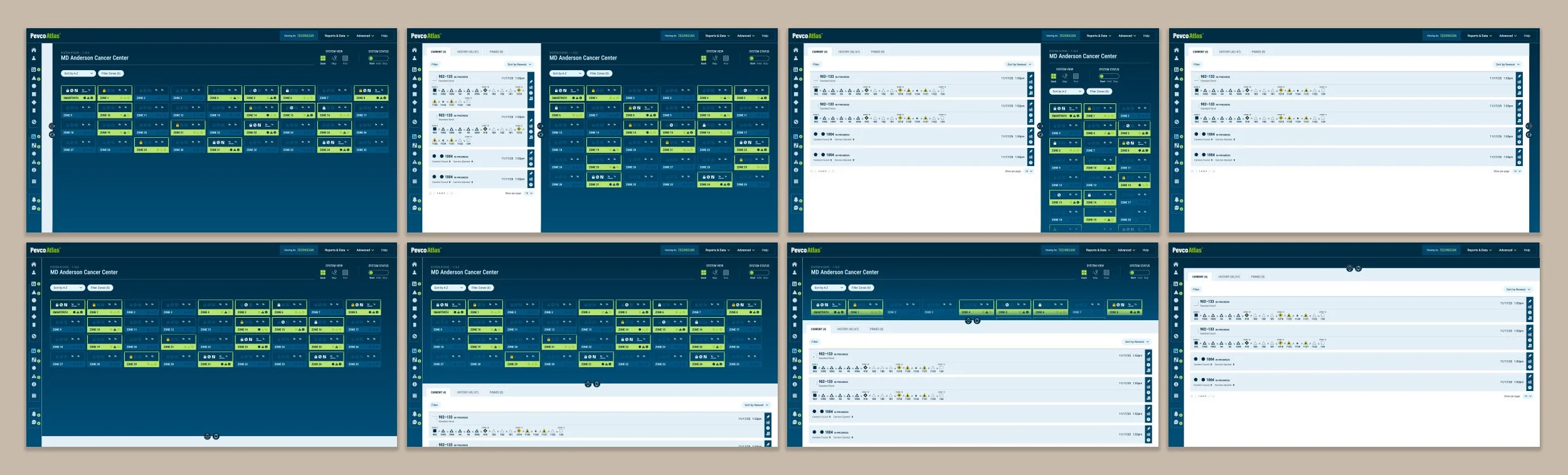
I created a two column layout for the core screens of the software; the right half’s content provides a consistent overview for monitoring, and the left half is changeable to handle complex diagnostic processes. This structure eliminates the need to toggle back and forth.
All components within each side were streamlined as much as possible and provided cross-linking, so technicians could easily view the opposite information without excessively clicking to locate it. The component design was kept visually consistent in each side, even in different views. Regardless of which panel was being accessed, parallel tasks used identical icons and placement—actionable items were consistently placed in a dark bar, with informational items in the light bar.
THE CHALLENGE:
Even the smallest pneumatic tube systems are composed of dozens of parts, each with their own functionality and data. Use cases can thus vary widely, but the Pevco Atlas UI did not offer the flexibility to cater to differing scenarios.
I knew from training that there were improvements that could be made for each core feature. However; the site as a whole had a larger flaw that needed to be addressed first. Technicians each had their own way of working, partially based upon system size; larger system complexity grew exponentially, multiplying from tens or hundreds to hundreds of thousands of pieces. However, the layout did not change based upon not only what the user was looking to accomplish, or based upon their preferences.
In the past, Pevco offered a UI that users could deeply customize. However, this made customer service difficult, as agents would need to familiarize themselves with a specific user’s setup before even beginning to work on the issue. Customization would need to strike a practical balance between the two competing needs.
THE SOLUTION:
The new dashboard structure allows the user to alter the UI based upon only two aspects, creating eight potential layouts for the user to pick from.
Users could utilize the toggles to:
Select the primary vs secondary panel, or hide a panel entirely. If both were displayed, one of the panels would take up 2/3 of the screen while the other would take up the remaining 1/3; users could toggle which was which, giving the primary panel of their choice with more room to work.
Choose a vertical or a horizontal view. The user could opt to rotate the screen to show the information in a tall, narrow format or a short, broad format. The information displayed would reorient accordingly, making some tasks easier to accomplish in one vs the other format.
With these options, users could find their own optimal workflow for the required task or the enterprise system size without doing any additional setup or being locked into one view for all aspects of their usage.
THE CHALLENGE:
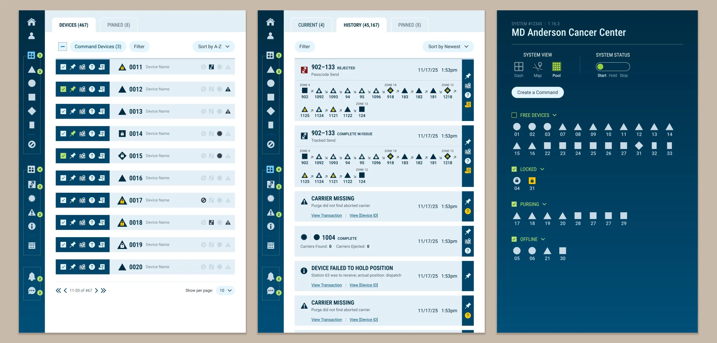
The previous Atlas system used icons and color coding extensively, but its UI assumed expert knowledge and provided no explanations. In addition, the sheer quantity of these cues made memorization impractical to impossible.
The Pevco team was not incorrect in a strong icon and color system being necessary, but their existing UI was a jumble of icons with seemingly no logic, often shifting in meaning between sections. Similarly, color coding was used so excessively that it became overwhelming and difficult to follow. To be effective, it had to be pared back to be easily understood, and an easily accessible explanation had to be readily available for newer users.
THE SOLUTION:
I used the navigation as an opportunity to also solve the labeling concern by creating a stacked vertical navigation bar that displays all of the systemwide icons, creating a constantly visible key upon hover.
I took painstaking care to ensure that every icon in the navigation is used consistently across the UI. This ensured that, if a user saw an icon on the page and forgot its meaning, looking to the consistently visible navigation bar would provide the answer with zero clicks or leaving the page.
Color was similarly simplified when I noticed that there were generally only two states when the existing UI used color: on vs off, or yes vs no. This allowed me to make the UI design itself act the color coding, without users needing to memorize a specific color’s meaning. If a status was significant, it was given the opposite color of the design, allowing it to catch the eye; if it wasn’t, the color scheme would blend so the information receded. There was only one exception: processes that required manual attention, such as when devices were locked by users. In this single instance, I instituted a yellow color to draw attention and used it consistently across the entire dashboard.
THE CHALLENGE:
Impromptu feature requests, accepted with no real integration plan or UX strategy, led to the Atlas dashboard becoming bloated over the years. Even so, it was still missing key functionality that would speed a user’s workflow.
Throughout the project, the client was consistently open to new ideas and perspectives on what would improve their software, but their ideas were reliant upon secondhand information. Although the training I was offered was initially intended to help me contextualize the interface, I saw it as an opportunity to workshop with real users and observe their struggles. There were approximately a dozen participants working with one excellent Pevco trainer; after they became aware of the project and my role, they were quick to share their opinions through the course of the training sessions.
THE SOLUTION:
Utilizing user feedback, I was able to identify pain points in the user flow and make recommendations for new features that the client had not considered.
Working with the core client team while receiving guidance from the training team, we were able to plan for the following new features:
Critical status information is consistently visible in the stacked vertical navigation’s numbered alert bubbles.
Revamping the login process, so that users could monitor the system without worrying about timeout.
Implementing system views of differing complexity, including a technician view for standard processes, a clinical view for simplified features, and an admin view for complex editing capabilities.
Revamping the system map for easier access to data, as well as creating the ability to drag-and-drop its structure to adjust for real-world conditions.
Adding logs and a commenting system within device and process sections, to better track activities and provide added context.
Creating a simpler relationship between technicians and on-site hospital staff utilizing chat functionality that syncs between the app and the kiosks.
Many of these features will require phased launches throughout the next year, but based upon our research the team is already confident that users will be enthusiastic about the upgrades.