NAPEO
SCOPE
Website redesign
MY ROLE
Art direction, UX strategy, UI design
MY DELIVERABLES
Web interface, annotations
CONTRIBUTORS
Aline Lin, creative director
Gillian King, junior UI designer
Kyle Sandstrom, front end developer
Trevor Mitchell, back end developer
Jodi McGill, project manager
TOOLS
Figma
PEOs, or professional employer organizations, help small businesses to be more efficient by outsourcing their administrative tasks, such as HR services or payroll. This industry is hugely impacted by governmental legislation, so NAPEO, the National Association of PEOs, acts as a unified voice for advocacy, to keep its members informed of changes, and to provide guidance for professional tasks.
NAPEO is the only trade association available for the PEO industry, so it is not only a one-stop-shop for its members, but also a reference point for government representatives and members of the public. These disparate audiences necessitate a massive quantity of unique research material, but the current site does not effectively help users to locate this information or content editors to maintain it. NAPEO hired our team to completely overhaul its site structure, CMS, and design system.
THE CHALLENGE:
NAPEO offers guidance on almost any singular topic that one can encounter in the PEO industry; this quantity and specificity is an asset to members, but makes site structure and navigation difficult.
A usability study with current NAPEO members demonstrated that the overall information architecture of the site didn’t need to be completely reinvented, the categories did largely make sense to users, but its menu structure was inadequate. The actual content that users needed was frequently buried on 4th level pages, but its menu only supported 1st and 2nd tiers in its dropdown structure. Worse, the second and third-level pages that users were forced to interact with to drill down to the desired content were not otherwise valuable, making browsing a repetitive chore.
THE SOLUTION:
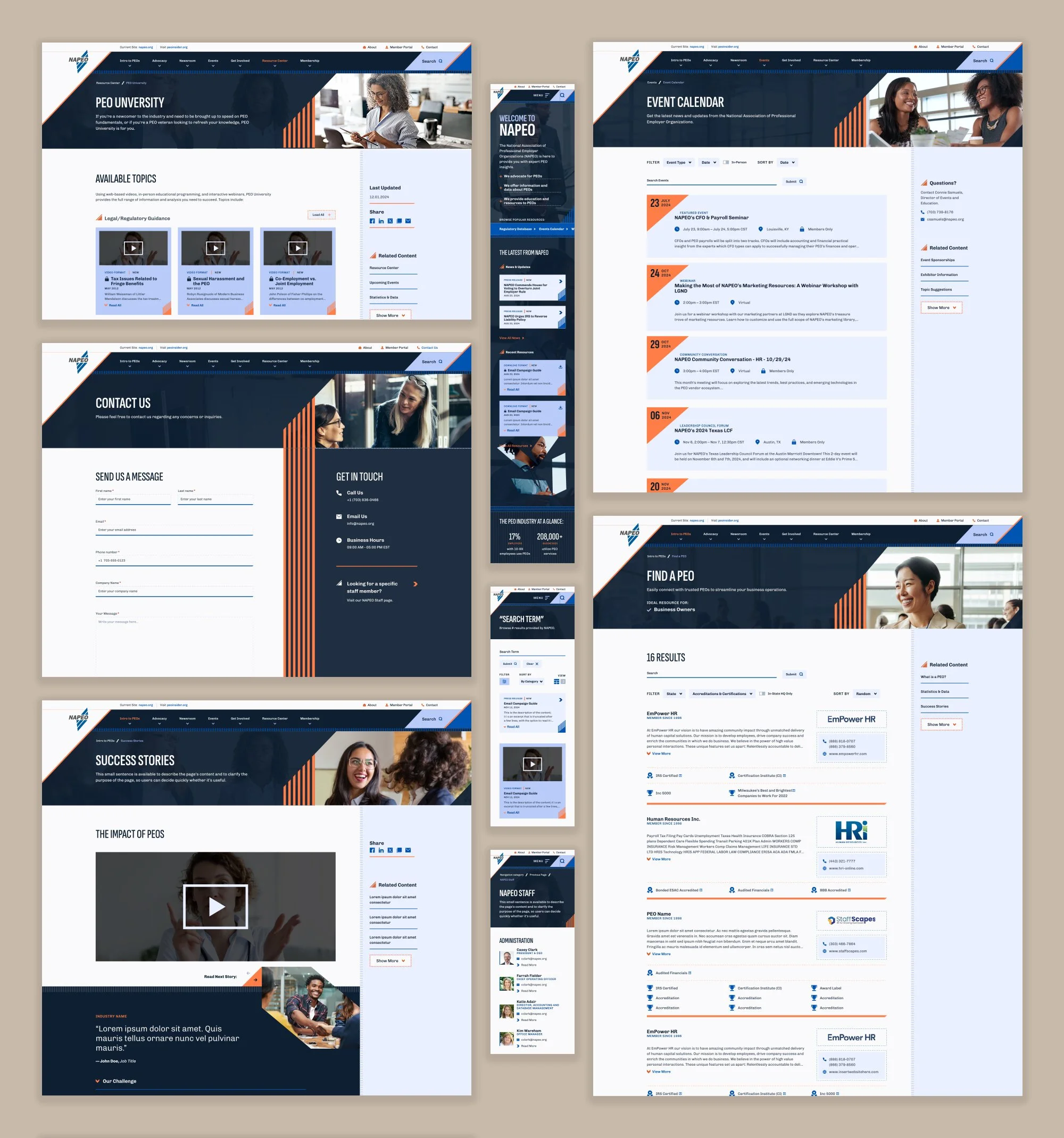
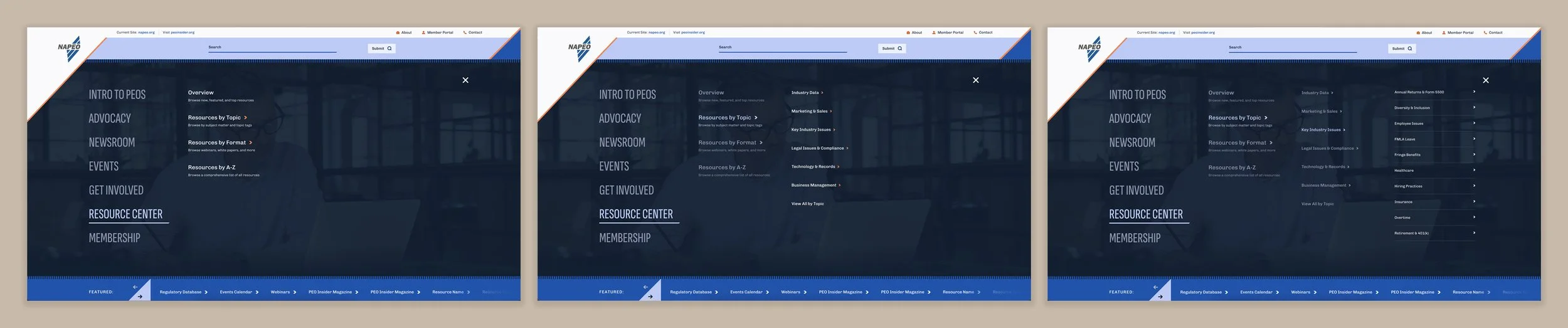
To improve this experience, we created a navigation structure that could support, but did not require, up to 4 levels of content per section.
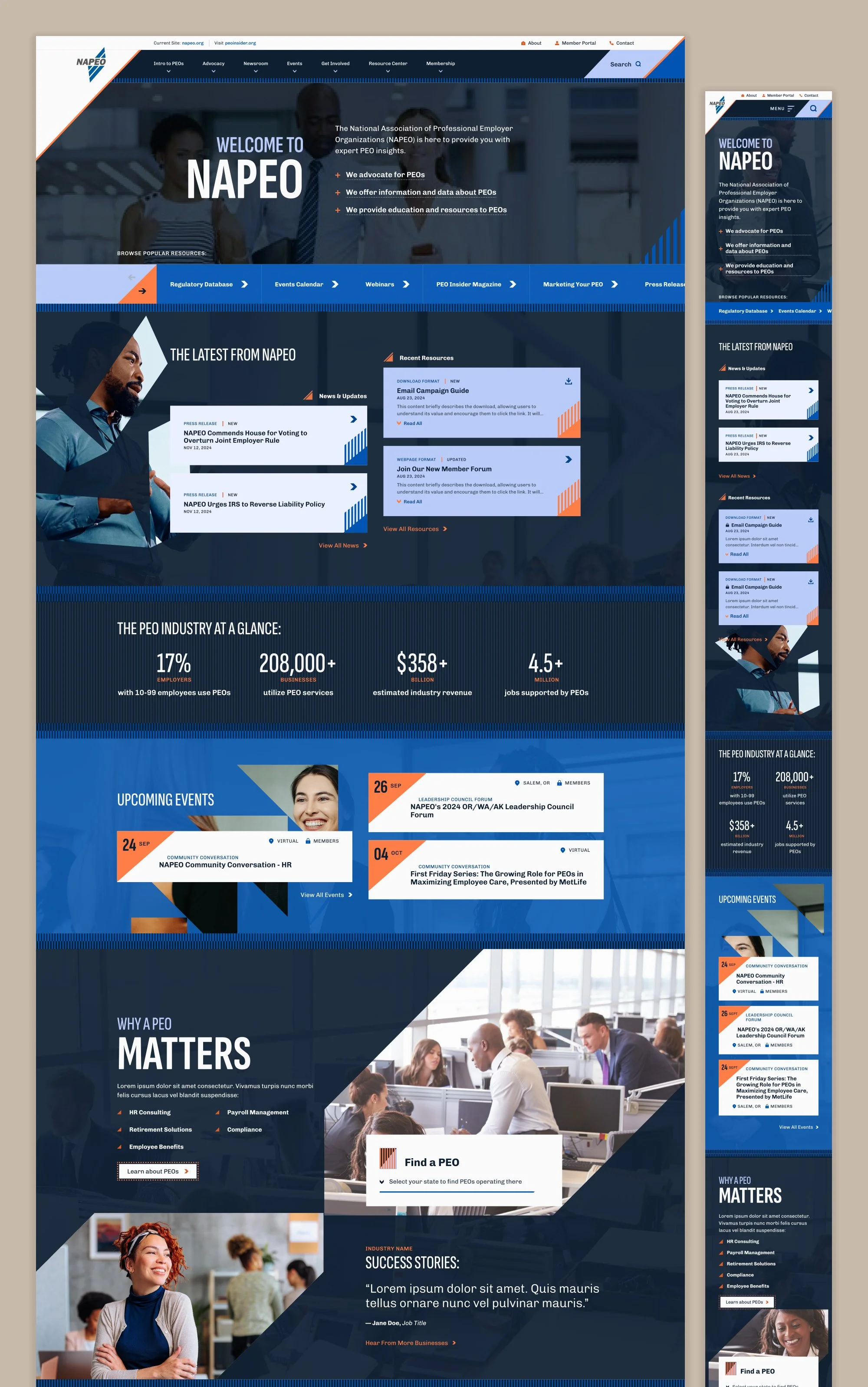
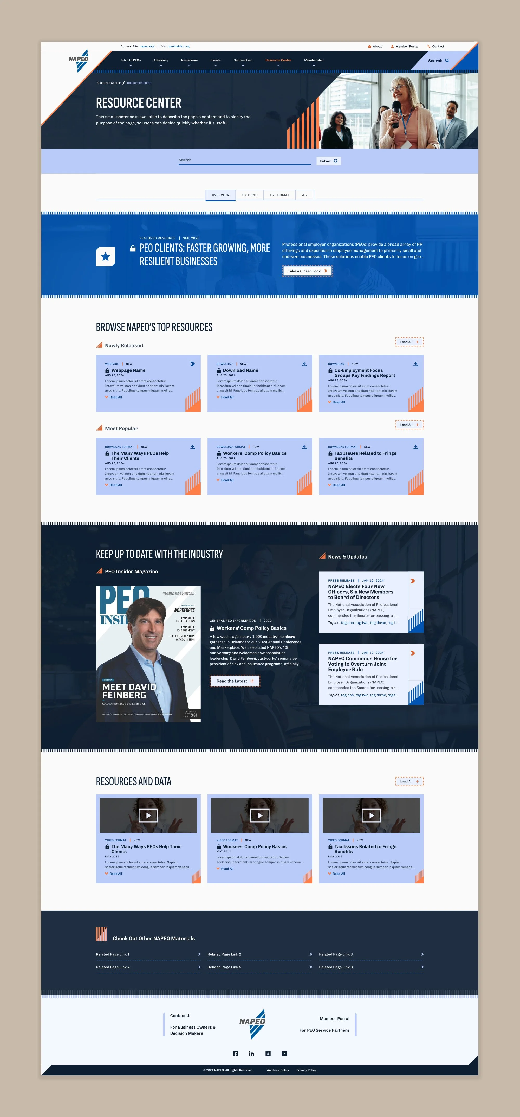
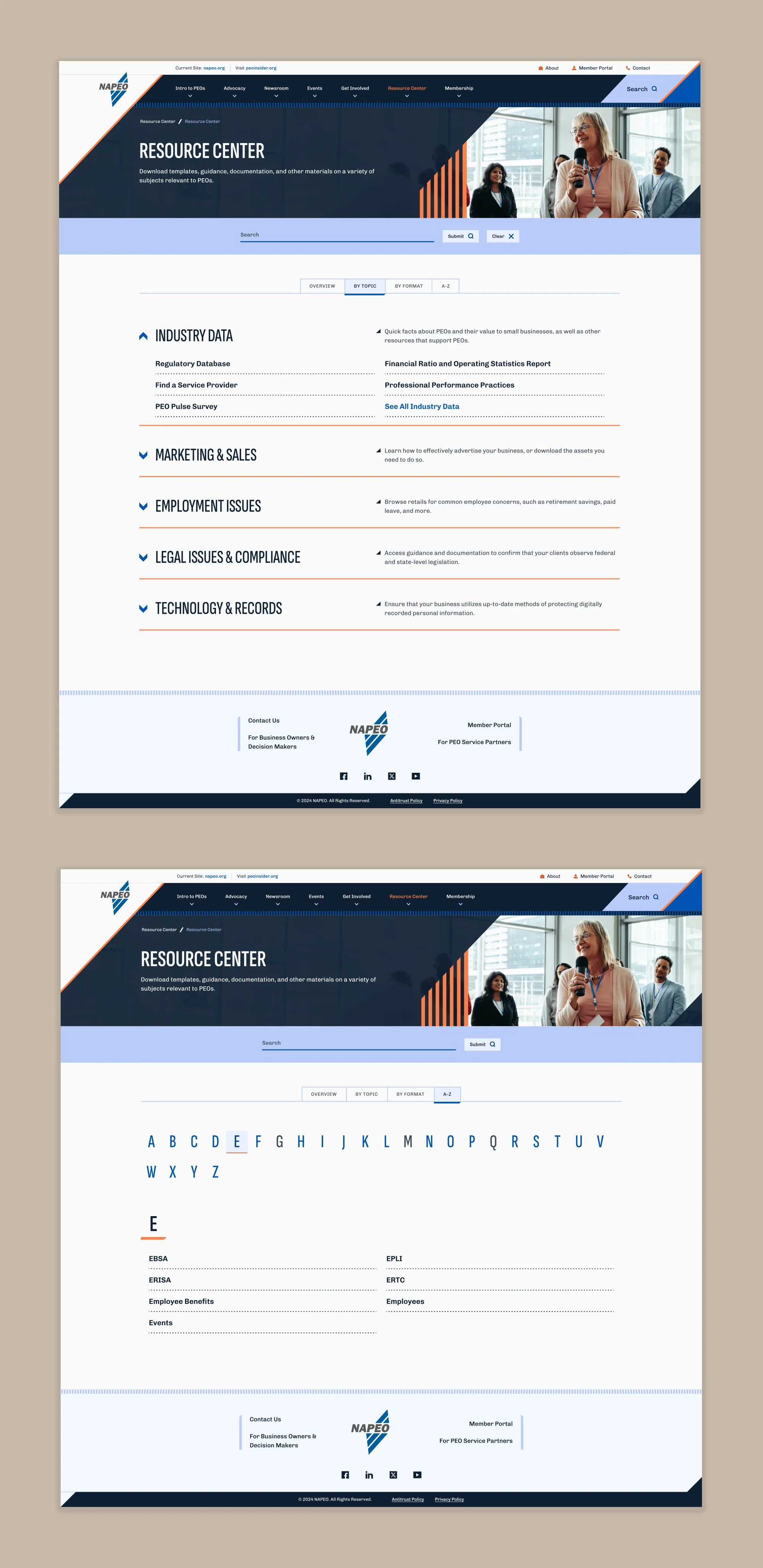
Using a full-screen mega menu structure, we created an experienced that used left to right expansion to mimic the page tiers. Each menu level’s content was created to include short descriptive text, allowing users to confidently narrow their choices without reading a full page of copy. To keep the number of options approachable, levels 1 and 2 were capped at seven choices or fewer; level 3 was given slightly more flexibility, but exceeding 10 was reserved for extreme cases. Level 4 was only to be used in areas like the resource center, where users knew exactly the phrase they needed to find, as this level could scroll and support any quantity of alphabetized options.
THE CHALLENGE:
Despite hosting these hundreds of resources, NAPEO’s site was archaic and limited for both users and content managers.
The NAPEO web governance team was relatively limited in size and available man hours, yet frequently found themselves wasting time managing resources manually, on the individual page level. Rather than using any type of data structure to take the load off, content editors were responsible for grouping the resources, ordering them, updating them, verifying they were still active, and removing them from any location on the site if they were no longer needed.
The experience was just as poor for site users. Even if a user managed to find the correct location on the site, they were greeted with a wall of words: endless lists of bulleted links, with no additional design elements to guide the eye or make browsing easier. Should that be too overwhelming, they may try searching the site, but it offered no options for this beyond basic keyword match. Obviously, this made browsing a tedious and frustrating process.
THE SOLUTION:
We created a data taxonomy that would both automate on-page content population and drive a more robust search and filtering experience.
A key goal throughout the course of the project was coaching the client through a new content management process. After all those years of manually updating static content, the idea of dynamic data driving site features was difficult for them to grasp. I worked closely with the client to create a dataflow plan, the core of which was a new hierarchical tagging system that included:
Child-level topic and format tags, which mapped to NAPEO’s tier 4 page topics. These tags would automatically populate level 4 of the navigation menu and the resource center’s corresponding topic or format tabs, ensuring those areas were always up to date and did not require staff resources.
Parent-level topic category and format category tags, which mapped to tier 3 page categories. These tags would populate level 3 of the navigation menu and the resource center’s corresponding accordions; they could also be grouped together to optimize browsing for highly similar materials, such as articles and white papers.
With this system in place, each resource was recorded in the CMS with a minimum of 4 tags applied to it, as well as an official title and description. With no further setup or editing required, the resource would immediately be available via the resource center, the navigation menu, and within search results. However, to ensure the client could create more custom experiences if desired, the resource center included a tab system that offered editable content in one area; we also designed a resource collection component and a featured resource component that could be dropped onto any webpage, ensuring quick access to curated materials from any point in the site.
THE CHALLENGE:
Although most members using the NAPEO site needed utility and fast location of highly specific resources, we identified other audiences that required a different strategy.
Through data and user analysis, we identified several fringe audiences, including:
Governmental representatives. These users needed to research and understand the impact of specific issues as legislation initiatives occurred.
Small business owners seeking to understand PEOs who accidentally found themselves on NAPEO’s site. These users needed to learn about the benefits to their company and to locate PEOs in their area.
Companies that provide services for PEOs themselves. These users needed support in compliance and billing, or to easily sign up to be included in NAPEO’s service provider database.
Other audiences were routinely identified by NAPEO’s marketing team, which focuses on paid search. These users needed logical entry points to the NAPEO site.
THE SOLUTION:
We provided NAPEO with the tools it needed to focus on custom storytelling in key site areas.
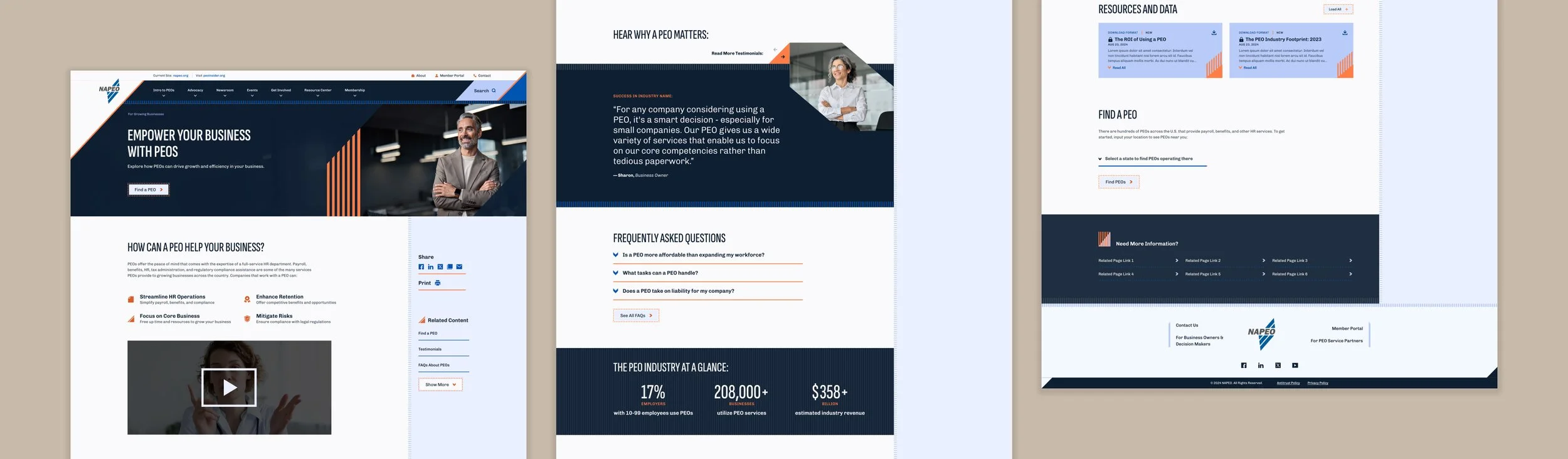
Although the vast majority of the NAPEO project was focused on technical aspects of CMS capabilities, we did not ignore the reality that content was the real driving force on the site. To balance these niche audiences’ specific needs, we created an audience-specific landing page strategy.
Rather than trying to create pages that had to balance varying conflicting needs, each micro audience was given a specialty page dedicated to them that was cross-linked in various areas. This allowed content editors to write and organize copy that suited the exact familiarity level and priorities that each group had, without worrying about also making content universally appealing.
NAPEO’s site was created using a component-based design system, so to ensure that the storytelling pages could be visually compelling, we created a variety of custom blocks to fit various unique types of content. These could be dragged, dropped, and reorganized as needed, providing NAPEO with the flexibility they needed to create additional pages in the future.
THE CHALLENGE:
With a history of many different designers, campaigns, and target audiences throughout the years, NAPEO’s branding had become a jumble of random elements with no core system or conceptual backbone.
NAPEO’s site design had become something like the ghost of Christmas’ past: the various visual trends of the last decade were all present in some shape or form, creating a mix of styles with no rhyme or reason. Together, they did not communicate anything about the brand other than visual inconsistency.
In addition, NAPEO as an organization did not have a style guide, so its other collateral was equally all over the place. Although a rebrand was not part of the project scope, we knew we would have to treat the website redesign as a full reset upon which the business could build.
THE SOLUTION:
We took the brand back to its roots, focusing on the original concept: the improved financial performance and growth that PEOs bring.
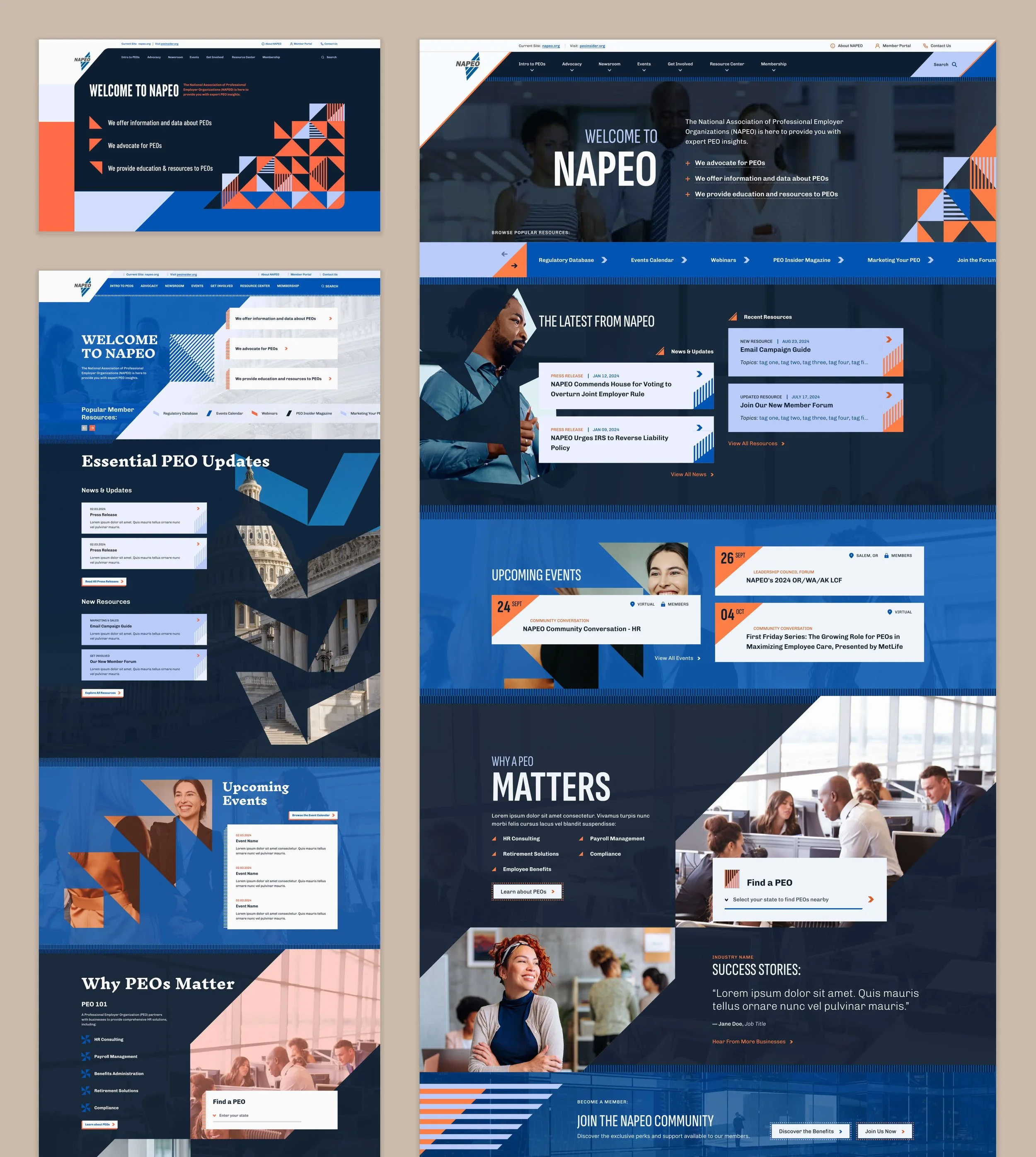
As NAPEO was a longstanding client, the design process was iterative, involving input from three designers familiar with their business model. First, our junior UI designer created a concept with promising elements (shown below, bottom left), but struggled to find consistency from section to section or to effectively guide the eye. Next, our creative director stepped in to demonstrate an alternate look and feel that offered more drama and richness above the fold (shown below, top left); this approach was closer, but lost the connection to the human side of HR and didn’t take into account complex content needs. I was responsible for creating the final design concept that cohesively blended elements from both designs, balancing them against the user experience to ensure critical content could be located easily and without excessive scrolling. I highlighted the original brand idea throughout the site structure by consistently incorporating upward angles, using them strategically to direct the eye, differentiate content areas, and create animation transitions.
With the design direction in place, we elevated and expanded the brand into a full design system. We created custom patterns and icons based upon its iconmark, ensuring the chunky, sharp style was consistent through its UI elements. We grew its limited color scheme by finalizing a range of bold oranges, deep blue-blacks, and pale periwinkles. And finally, we continued to create tension and interest throughout the site by contrasting slightly retro elements, such as almost-hand-drawn shapes and blocky type, against sleek modern touches, such as parallax scrolling and video content. The result? A new, robust brand style that NAPEO can carry into the future and apply across all of its many channels.