Family Physicians Do More
SCOPE
Brand identity, website design
MY ROLE
Graphic design, UX strategy, UI design
MY DELIVERABLES
Logo, brand design system, web interface
CONTRIBUTORS
Aline Line, creative director
Steven Portas, front end developer
Alex Oprica, back end developer
Jodi McGill, project manager
TOOLS
Figma, Adobe Photoshop
According to recent studies, the U.S. will face a family physician shortage of up to 86,000 doctors by 2036; with the elderly population growing, this could quickly become catastrophic. To help combat the problem, the American College of Osteopathic Physicians (ACOFP) stepped in to create a new initiative and attract students to family medicine.
Med students must be practical when choosing a specialty and weigh the hard numbers, like entry costs and expected salary, carefully against other priorities. But with the facts around family medicine often being misrepresented, ACOFP hired our team to brand and create a website for a new Family Physicians DO More initiative. The project aimed to create a new platform to engage the younger audience and provide trustworthy information.
THE CHALLENGE:
Many organizations like ACOFP offer support for students, but often students are just one of several target audiences. The Family Physicians DO More brand needed to demonstrate that its focus was only on students and their priorities.
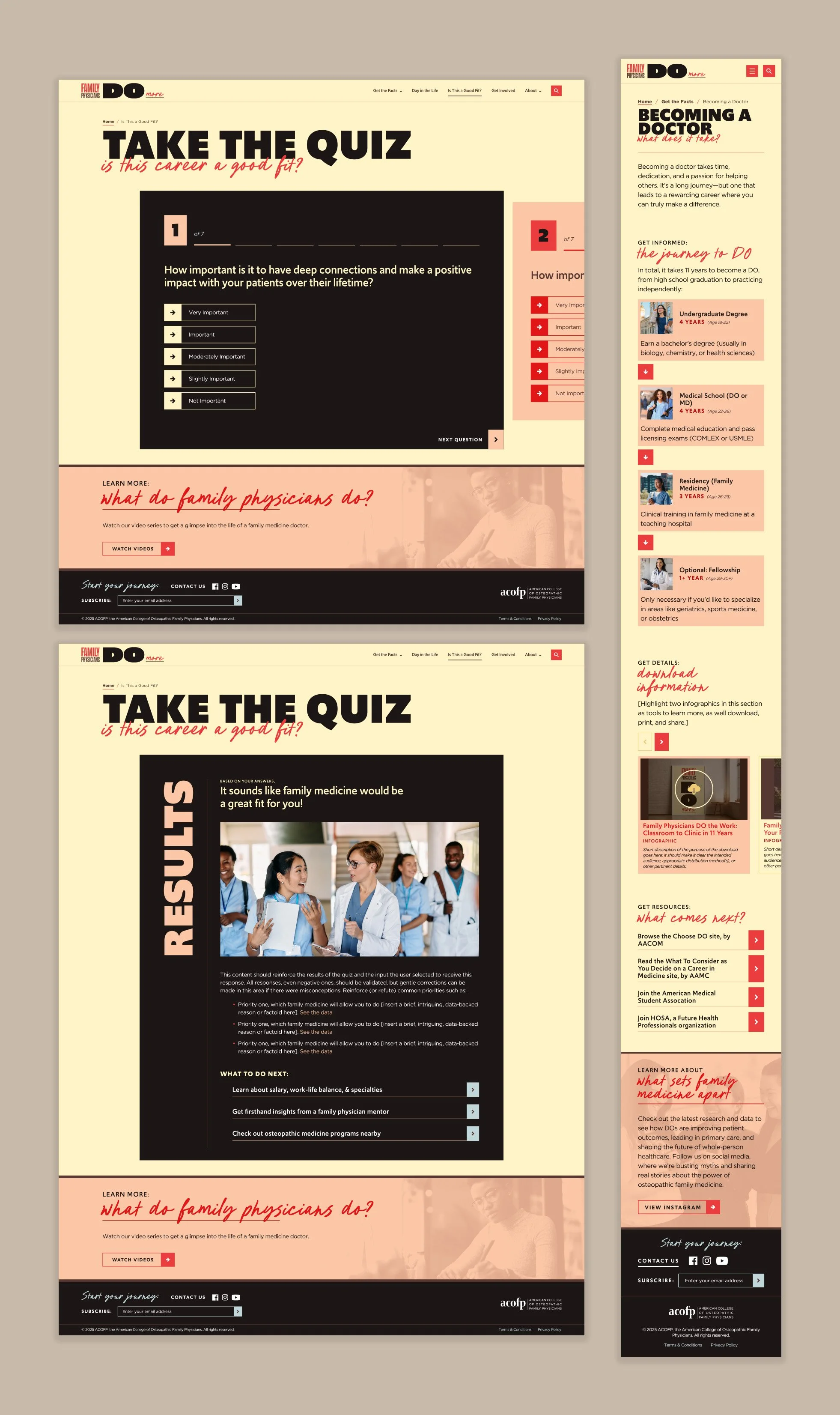
User research showed that one of the largest concerns for students when selecting a specialty is flexibility and the ability to practice one’s preferred type of medicine with different patient groups in different places; family medicine was seen as not being compatible with that goal. A key area of focus for the new initiative will be that family medicine programs all have identical core curriculums, but one’s practice and career path looks different for everyone; the branding needed to visually relay this concept.
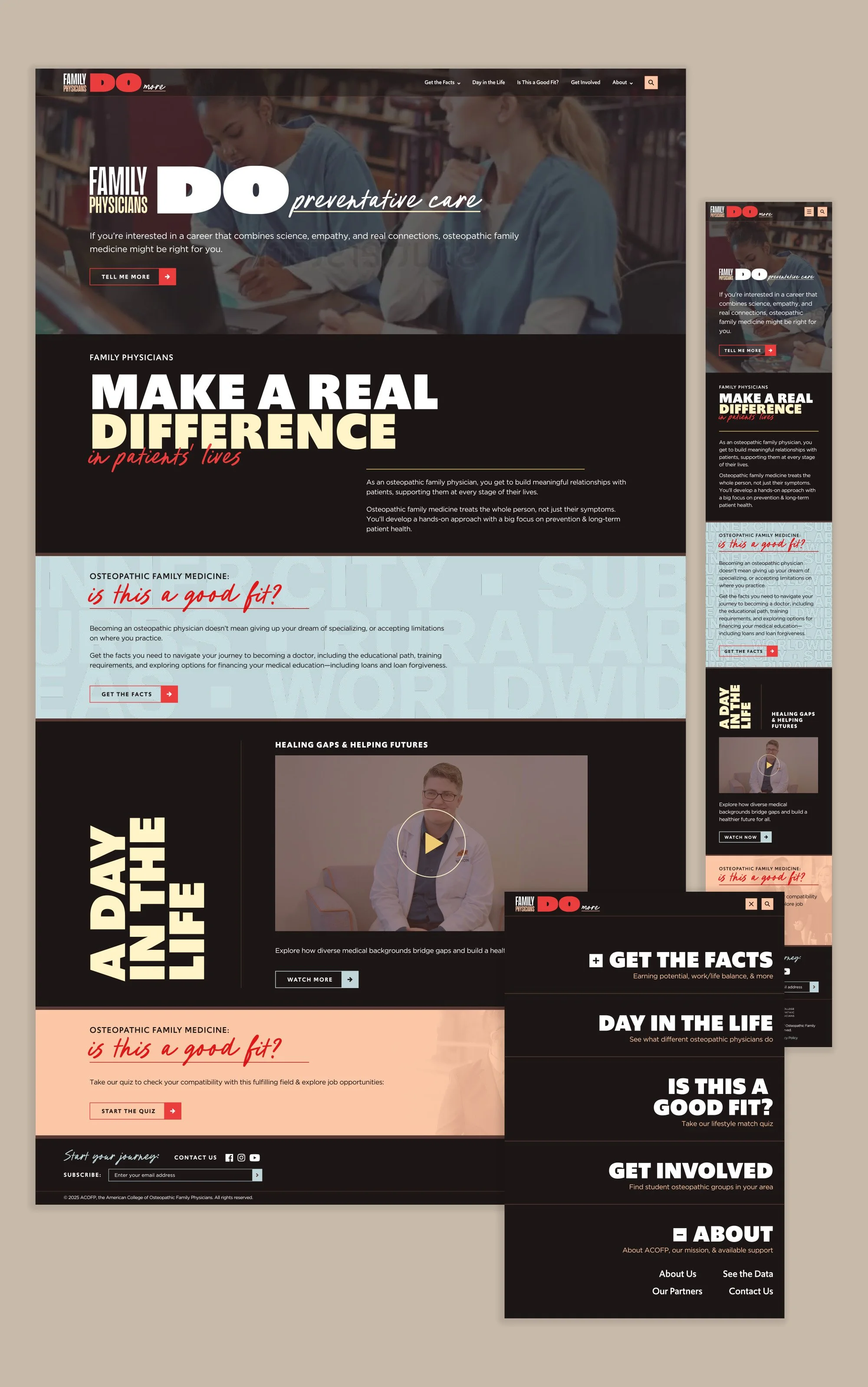
To achieve this, I created a visual dichotomy. The majority of the type is presented in a high impact style with a bit of modern funk to prevent it from appearing corporate, then paired with a selectively used irreverent handwritten style. The placement gives the appearance that a physician appended the logo with their own opinion, leaving their own mark on the content. I built on this tension with an asymmetric layout, tight spacing, and a slightly softened red and black color scheme with muted accent tones. It was a happy accident that the abbreviation for Doctor of Osteopathic Medicine is DO, so I worked in a bold text treatment and capitalization to subtly draw attention to this overlap with the action verb.
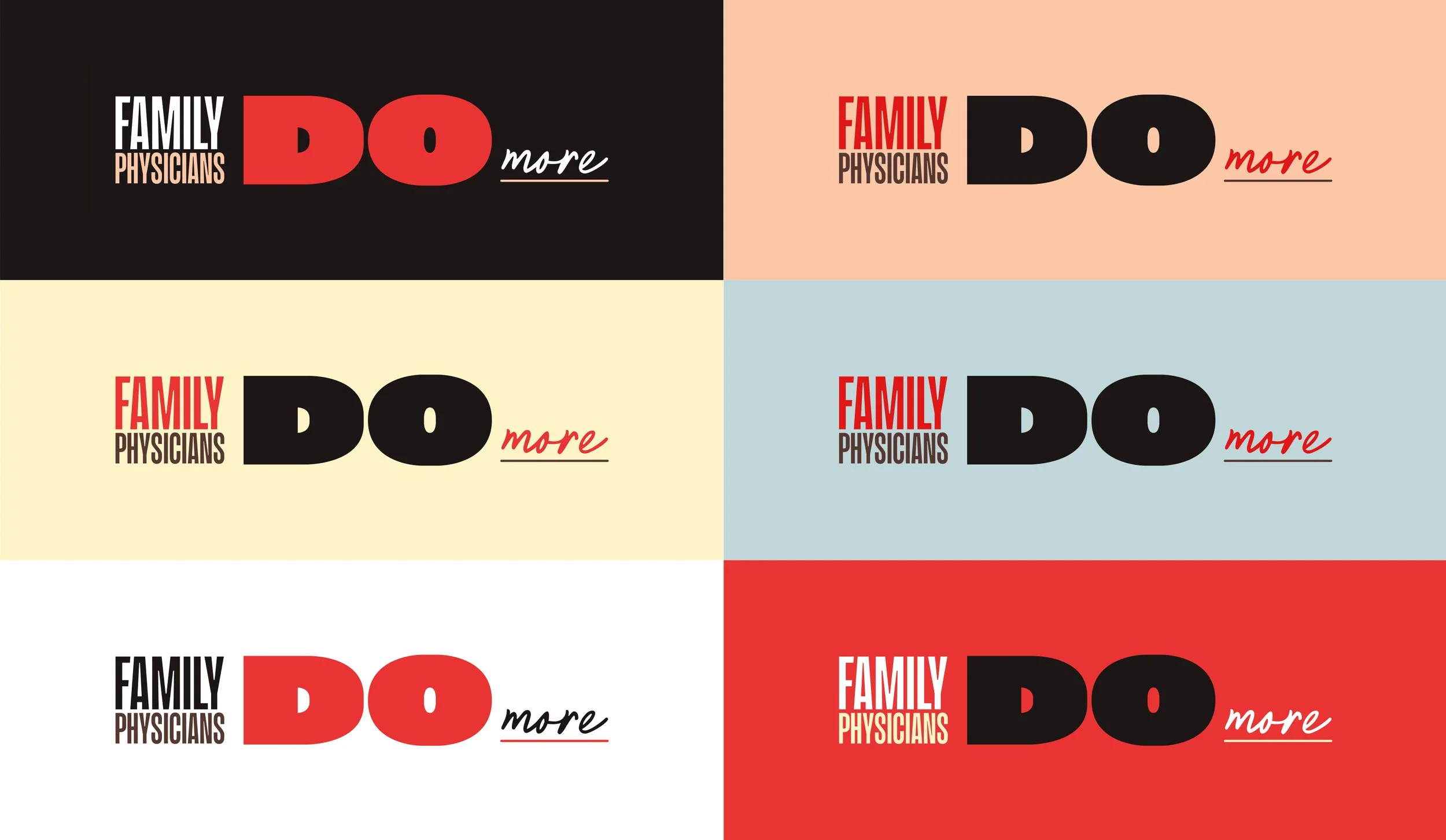
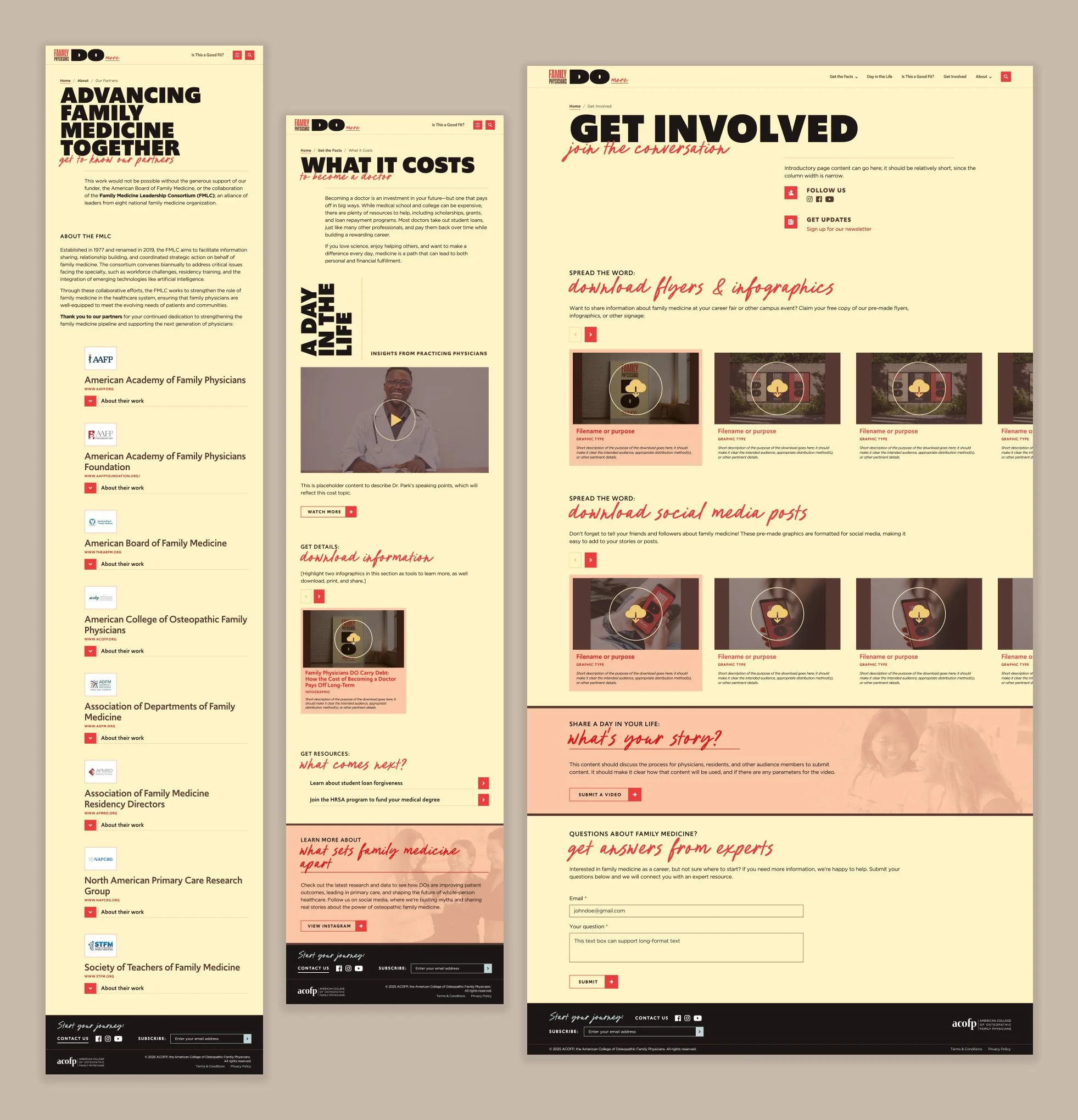
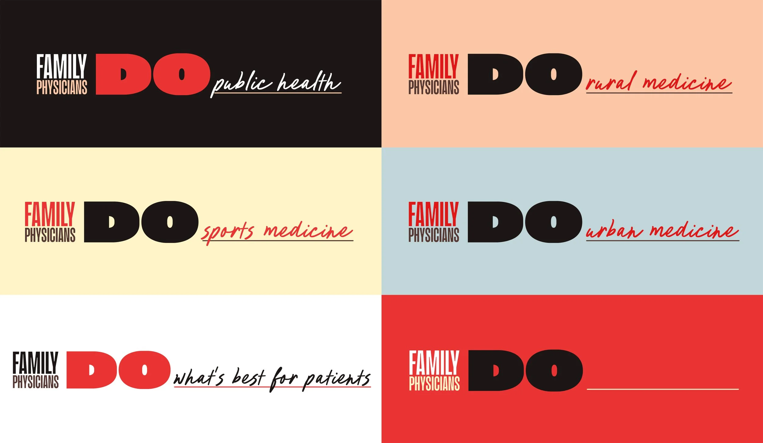
This concept was so well received with users that we decided to expand it into a full logo system. I replaced the ‘more’ with a variety of the most desirable scenarios and practice types, reinforcing the flexibility that a career in family medicine offers. As the initiative grows and printed materials are needed, this system can even be expanded to include the user, inviting them to physically leave their own written mark on the logo.
THE CHALLENGE:
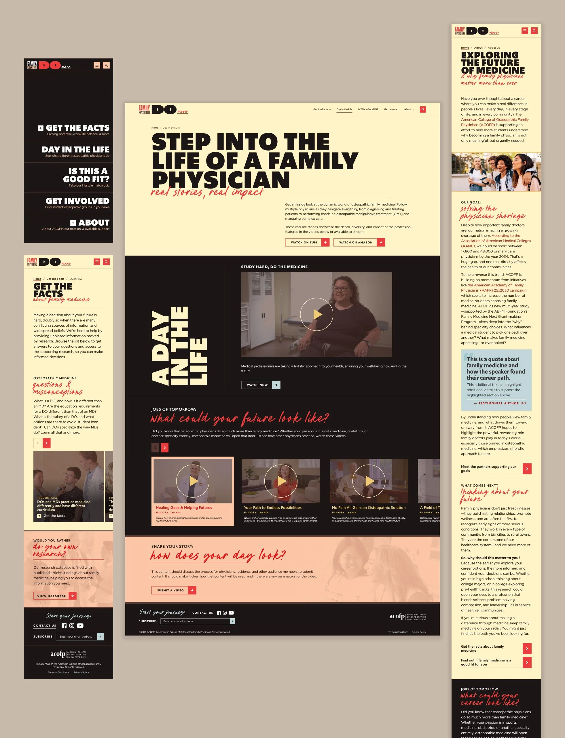
With prospects being roughly 15 through 25 years old, we knew we had to cater to the audience’s typical browsing habits by developing short-format content with an emphasis on video and interactive experiences.
Choosing a specialty is complex and has many factors, but we needed to find ways to present this information that made the user want to engage with it. The first and easiest was video: ACOFP had already been working on a series that interviewed real physicians, showing viewers what a day in their practice looked like. We highlighted this content throughout the site, giving an authentic face to the speciality with which users could connect. We also invited users to contribute their own experiences by providing content they created; this will be expanded in the future into a dedicated social media initiative.
Next, I worked on converting our written speaking points into other formats, including:
A quiz to gauge prioritization of various decision factors and how those weigh against family medicine. This quiz was framed with a positive, validating perspective and designed to be completed quickly; it also provided an opportunity to collect data for continued market research.
A series of mythbuster cards leading to webpages dedicated to the topic. Unlike the quiz, these addressed negative perceptions head-on, inviting the user to identify their beliefs and learn why they may be incorrect.
THE CHALLENGE:
Our target audience may be younger, but they also tended to be highly educated and very comfortable with research and statistics. Though an engaging site experience was important, it couldn’t lack the credibility found in data, or ignore the need for additional research and nurturing.
Unlike a typical website project, ACOFP began the process with a large volume of discovery work already completed: for the last year, their team had partnered with student volunteers to sort and catalogue several hundred scientific articles. These studies compared and analyzed various aspects of the industry against other specialties, and ultimately needed to be available to the end user to create transparency and build trust with our audience.
To do this, we first created a home base for this content in the CMS. For initial launch, all research materials were recorded as AMA-style citations with expandable summary text and basic tagging for the highest priority decision factors. A dedicated database page and the multi-tab search allow for simple browsing; in the future, this functionality will be expanded with additional keyword search, source or date range filters, and more.
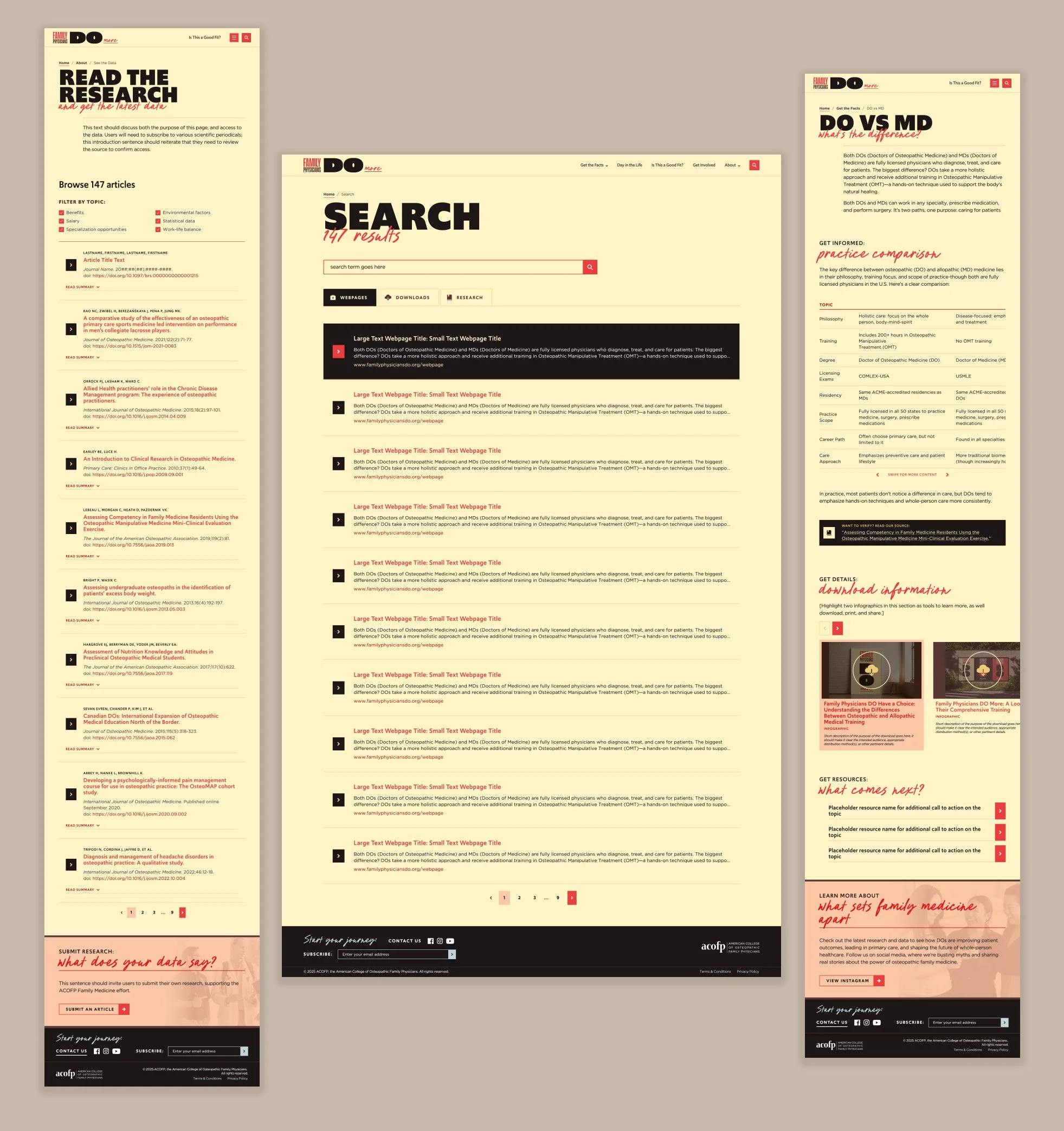
However, realistically, most students do not have the time or inclination to take on additional research projects; this database was important for highly interested leads and credibility, but could not be the primary presentation method or expect to receive sustained attention. Instead, we wove the research data through all interactive areas of the site, ensuring that all claims were backed up with citations offering one-click access to the applicable data.
Finally, it was important that the user’s research journey not end at the Family Medicine site. This project was funded by a time-based grant, so the team decided to split the project into a phase 1 MVP for launch, followed by a future phase 2. This later phase will include enhancements that focus on extra features, conversion points, and a full multi-channel nurturing strategy. In phase 1, we were able to implement two short-term strategies to support this:
The ACOFP team agreed to create new downloadable materials for nurturing in phase 1. To highlight these files, I planned out a data structure that would save them to the CMS with their identifying details, then serve this content on the individual page level and in the search results for easy access.
I tailored other sitewide content to include, as a standard, next steps for the user that would also be low lift for the client. My familiarity with the industry from redesigning ACOFP’s main websites was pivotal to this, and I was able to use that discovery knowledge to anticipate highlighting existing programs or even other organizations that would fill these short term needs.
Although this initiative is only just beginning, the response to phase 1’s work has already been overwhelmingly positive from both internal stakeholders and external users.