CORHA
SCOPE
Website redesign
MY ROLE
Usability research, UX strategy, UI design
MY DELIVERABLES
IA, reports, wireframes, web interface, annotations
CONTRIBUTORS
Aline Lin, creative director
Haymon Thit, front end developer
Adam Vauthier, back end developer
Jessica Stephens, project manager
TOOLS
Figma, Adobe Photoshop
Disease outbreaks are quite common within healthcare facilities, resulting in patient suffering and excessive spending. To help combat this public health problem, the CDC and other leading agencies came together to create CORHA, with the goal of vetting, consolidating, and providing expert guidance for outbreak response professionals.
The CORHA team is made up of dedicated epidemiologists, but most have primary roles within their respective agencies. While the CORHA website was maintained as best it could be, internal resources did not exist to make day-to-day improvements or plan strategic upgrades. With issues piling up, CORHA was able to secure grant funding and hire our team to completely reinvent its web presence.
THE CHALLENGE:
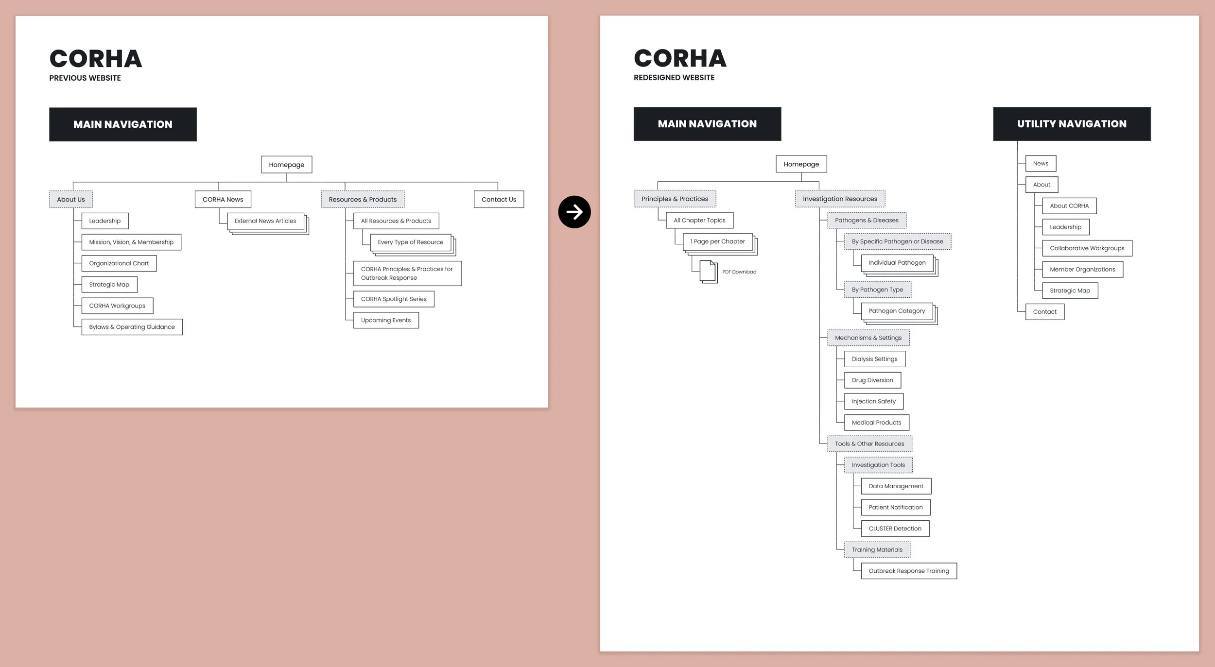
CORHA suffered from a common problem: a routine of inside-out thinking, causing its site to be structured around internal priorities & internal terminology instead of users’ understanding and requirements.
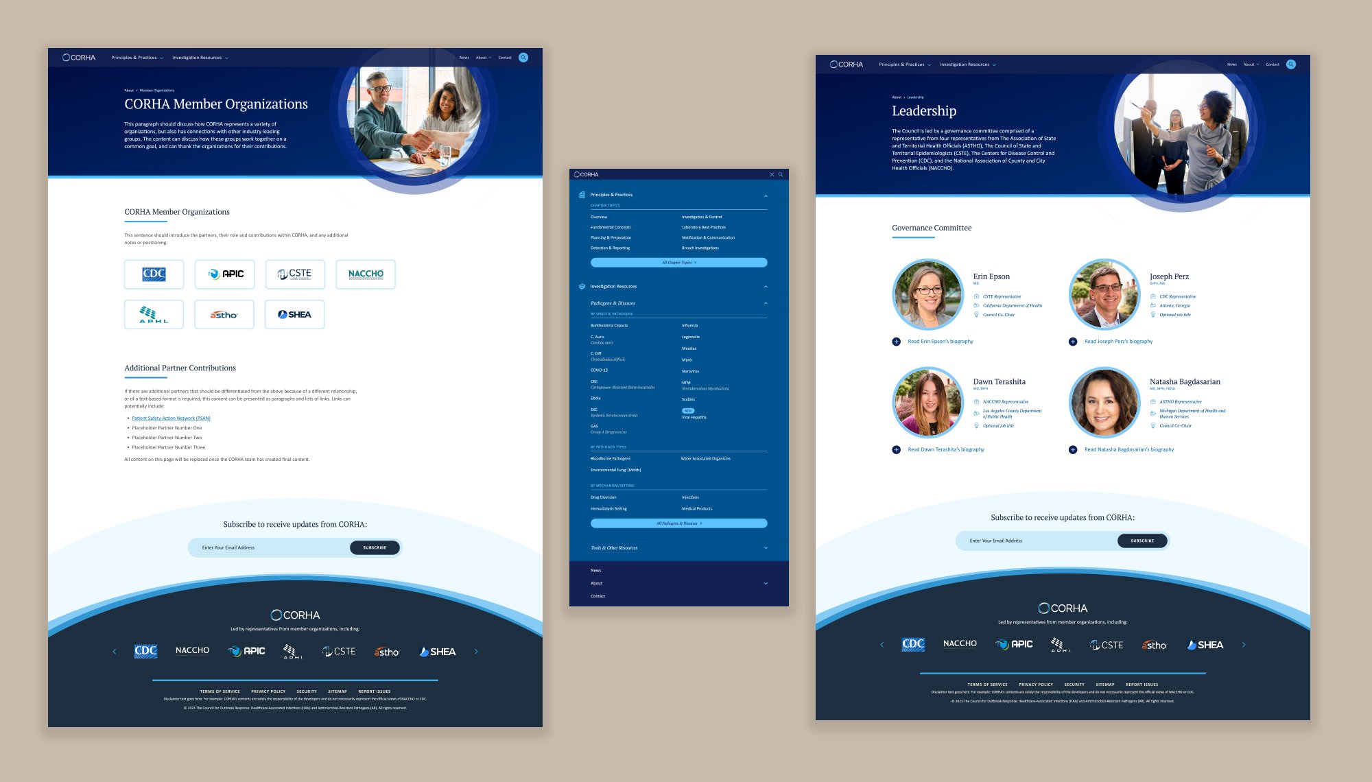
First, we restructured the site architecture around common tasks or user needs, improving access to different resource types and decreasing the degree of focus on the CORHA organization’s activities. Next, we reconsidered the labels and sub-categories, ensuring that new ones aligned with professional understandings. Finally, working with the client, we slowly transitioned them towards a new organization system.
Their new primary navigation now consists of just two main items:
Universal guidance documentation: CORHA’s primary in-house value offering (that was thus thought of as a ‘product’ previously, despite it being free to use) was highlighted first, as it is an applicable resource for all outbreaks. For quick access, the menu allowed users to jump between topic-driven chapters.
Outbreak-specific content: this was housed in a mega menu and divided by pathogen, transmission method, or management tool, reducing the need for lengthy click paths.
All CORHA-specific content was relegated to the utility navigation, as this was not priority content for users.
THE CHALLENGE:
While researching IA strategy with real users, our focus group revealed an unexpected flaw: from its beginning, CORHA had not been adequately serving its target audience’s basic needs.
From speaking to users, it swiftly became apparent that what an outbreak response looked like varied. Some facilities and health departments were what we expected: fully staffed, received adequate training, and utilized CORHA routinely to stay up to date. However, others had no such support and were forced to reference CORHA to put out fires as rapidly as possible without any additional resources; CORHA’s dense content approach was woefully inadequate for these emergency situations. In addition, trust and credibility were also a surprising concern—the CDC is a contributing partner in CORHA and of course has nationwide name recognition, but CORHA itself is less known, even within the industry.
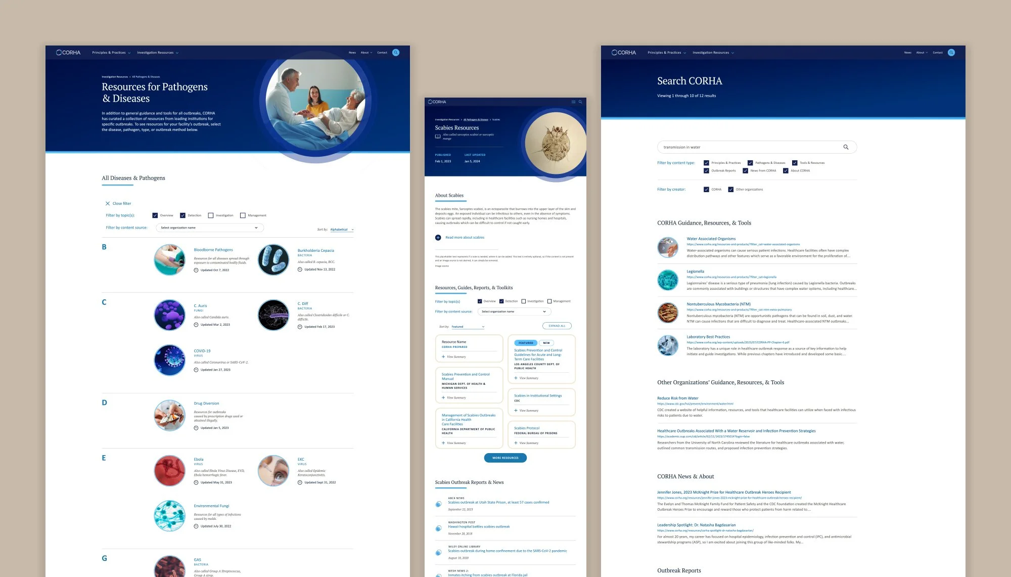
With these takeaways in mind, I worked with the client to update CORHA’s proposed content and web strategy. To build transparency, I highlighted the contributions of the agencies that make up CORHA, then ensured that all materials tracked ownership, publication data, and updates. I also created context into the intended audience, both the facility type and job role, to allow users to rapidly parse through complex information. Finally, I demonstrated to CORHA how its content could be broken down into a much more approachable presentation that supported users’ tight timelines.

THE CHALLENGE:
Throughout the project, it was critically important for us to be aware of the limited manhours CORHA could offer and only propose solutions that allowed for slow implementation or reduced site management demands.
Although the focus group provided excellent feedback justifying site expansion, these radical content improvements would realistically be a multi-year effort for CORHA. With this in mind, I structured all page layouts to degrade gracefully: each had predictable core content that was already available and would be present on launch, then planned upgrades that could be filled in as the team had time.
Where possible, I also guided the development team in structuring site data to further reduce CORHA’s workload. The navigation structure and index pages were created to be maintained automatically: each pulled in specific fields from pathogen or document content, then organized and presented them according to logic I created. Similarly, external news articles were maintained as one list in the CMS, but programmed to populate the homepage and specific pages after association with specific pathogens. Finally, to balance user experience with the burden of content maintenance, I reduced the outbreak response process into a simple 4 tag system; this was applied to collections of external resources, allowing site visitors to filter easily without creating excessive work for the CORHA team.
THE CHALLENGE:
CORHA’s original site design was so simplified that there were few visual indications as to the type of organization CORHA is, the intended audience, or even whether the site was professionally reputable.
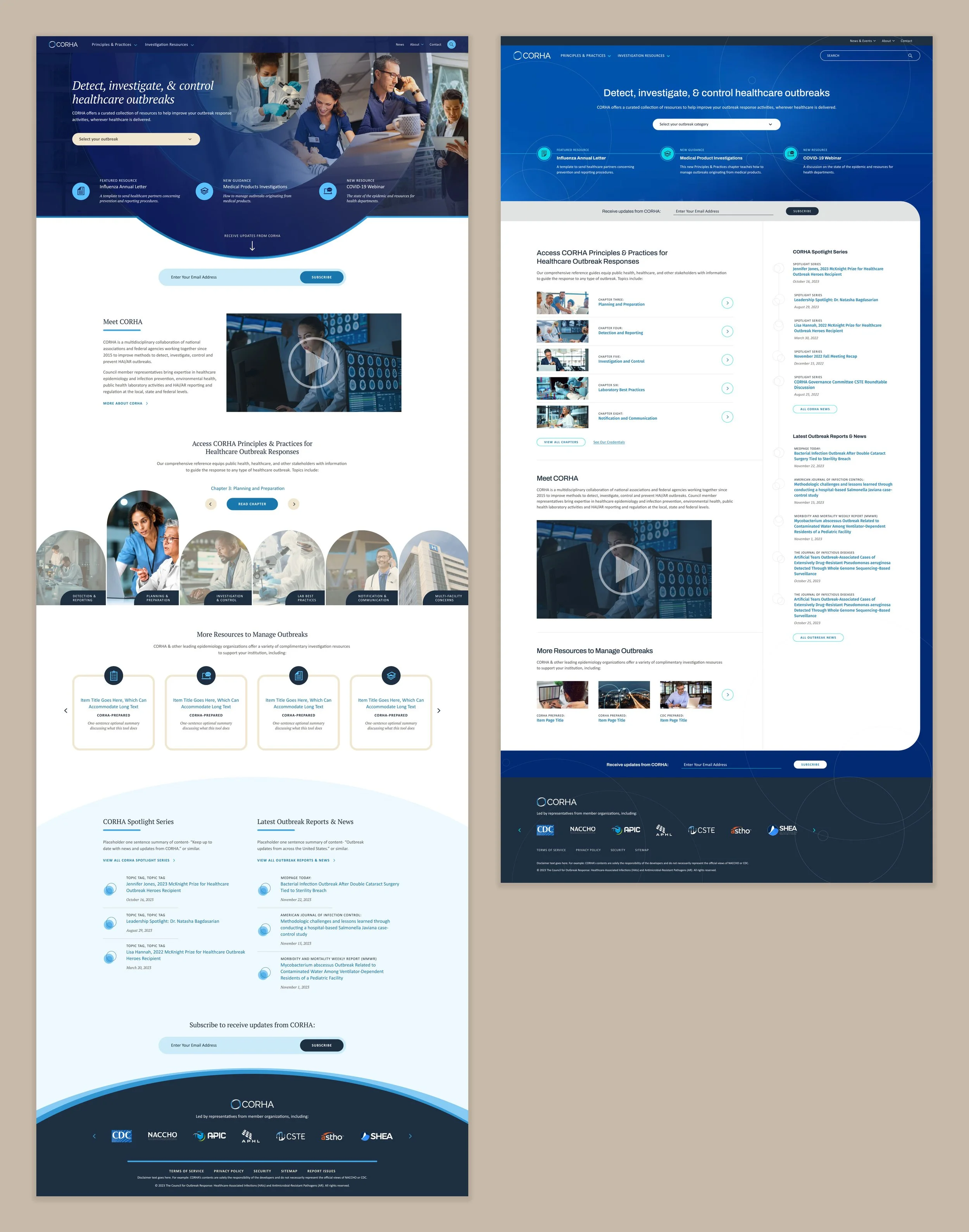
With an improved user experience in place, it was time to get the team thinking beyond their blank canvas. Their previous site was utilitarian to the point of having almost no visual identity, so the team had a choice to make: whether the new site should continue largely in that vein, or whether a stronger visual aesthetic was desired. To demonstrate these choices, I created two design concepts for them to choose from.
Concept one was a highly visual design that would give CORHA a recognizable brand identity. Its backbone was the header graphic, a layered collage that mapped the steps involved with outbreak protocol, from detection through treatment, reporting, and management. Each layer showed one step of this process and formed a bullseye shape that referenced both the CORHA logo and the targeted nature of CORHA’s activities.
Concept two was a pared back design that allowed the content be the star. It still provided more visual interest than CORHA’s previous site, but overall it spoke softly, using a strong grid, clear blocks, and minimally stylized typography to guide the eye. The goal here was to give the appearance of a document database focusing on research rather than an organization with its own standing and voice.
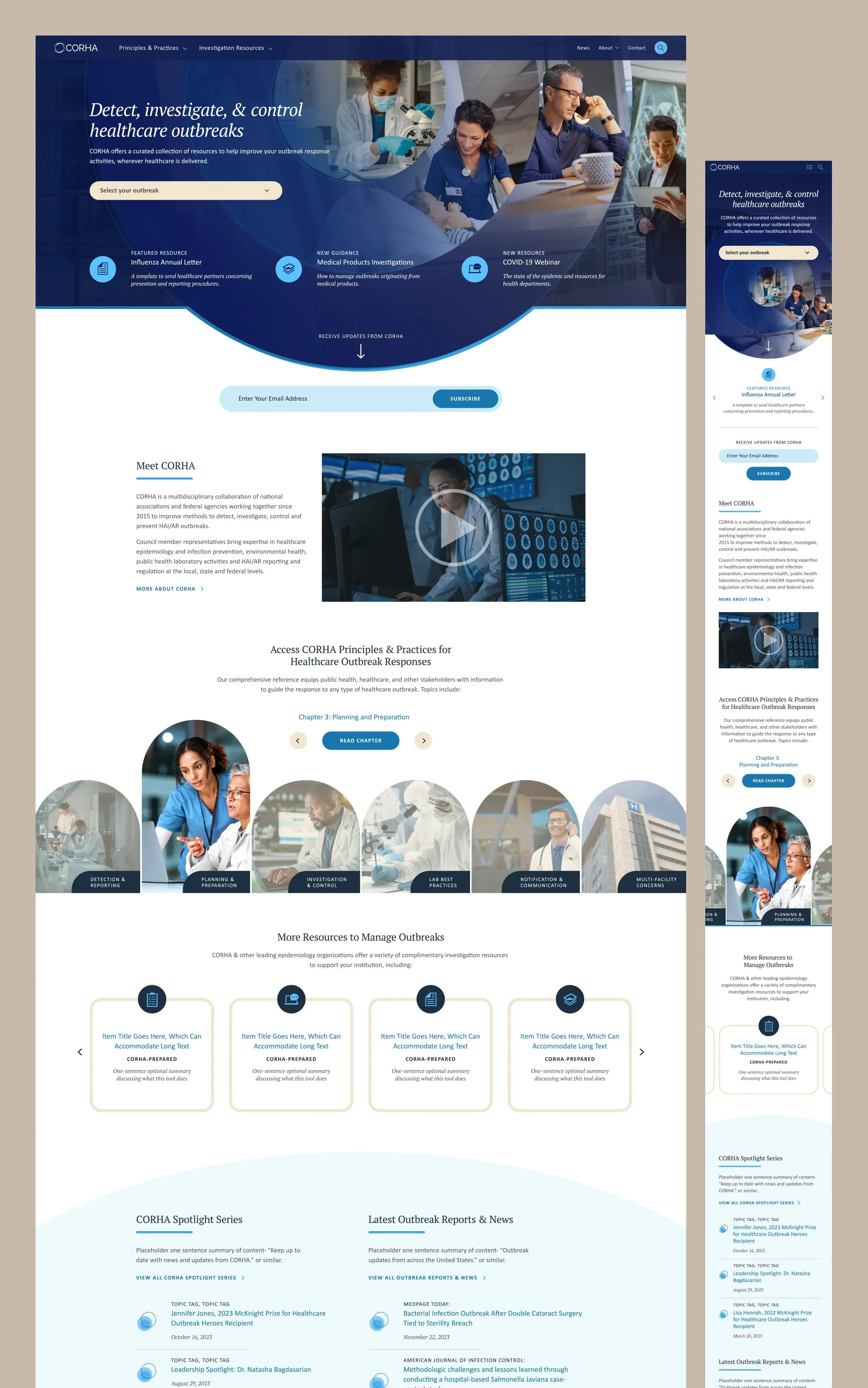
Concept one ultimately received enthusiastic client approval, so I expanded it into a full system. I applied the motif to the remaining pages of the site, creating stylized internal page headers, thumbnails, abstract background patterns, and more. Interactive elements were designed to reference the idea in their hover states or clickable formats. Finally, I developed simplified supporting iconography that balanced the saturation and complexity of the core graphics. The result was an engaging, interesting visual identity that elevated the CORHA brand and communicated its core purpose.
