Chesapeake Flooring
SCOPE
Rebrand, website redesign, packaging design
MY ROLE
Graphic design, UX strategy, UI design, marketing strategy, art direction
MY DELIVERABLES
Design system, IA, web interface, marketing collateral, packaging concepts
CONTRIBUTORS
Tony Casale, creative director
Shannon Turner, project manager
TOOLS
Sketch, Adobe InDesign, Illustrator, & Photoshop
When do-it-yourself home renovation content became popular, it rapidly changed the luxury flooring industry forever. Distributors like Chesapeake Flooring were forced to adjust their marketing strategies, balancing their established appeal for trade professionals with a new focus and expanded offerings that target the average homeowner.
By opting not to work with contractors and designers, homeowners were now directly encountering distributors for the first time. To court this new audience, brands were forced to anticipate and offer an experience of luxury from first touch to the point of sale. Chesapeake hired our team with this in mind to execute a full rebrand, create a new consumer-focused website, and update their packaging.
THE CHALLENGE:
While contractors are largely concerned with the price point, availability, and ease of installation for a product, homeowners have to be sold on the quality of the product and of the brand, as well as imagine the experience of using it.
Unfortunately, Chesapeake Flooring’s existing branding did a poor job at conveying the quality of its products; its logo was simplistic and old fashioned with a heavy black color scheme, neither of which appealed to current shoppers. And despite having been founded in and named after the Chesapeake Bay region, a place rich with local color and heritage, the brand gave no visual indication of its own history or origin.
Our team used the design process to show Chesapeake that it could take its brand in one of two directions:
A more modern, bold, and dramatic aesthetic that looked to the future (left). This minimal, abstract approach was based off of the dimensionality of the bottom plane in a space, referencing the solid foundation that flooring provides.
A softer, more quietly dignified approach that referenced its past (right). This approach referenced the nautical alphabet’s letter C, skewing the shapes to give them dimensionality and subtly reference a typical hardwood laying pattern.
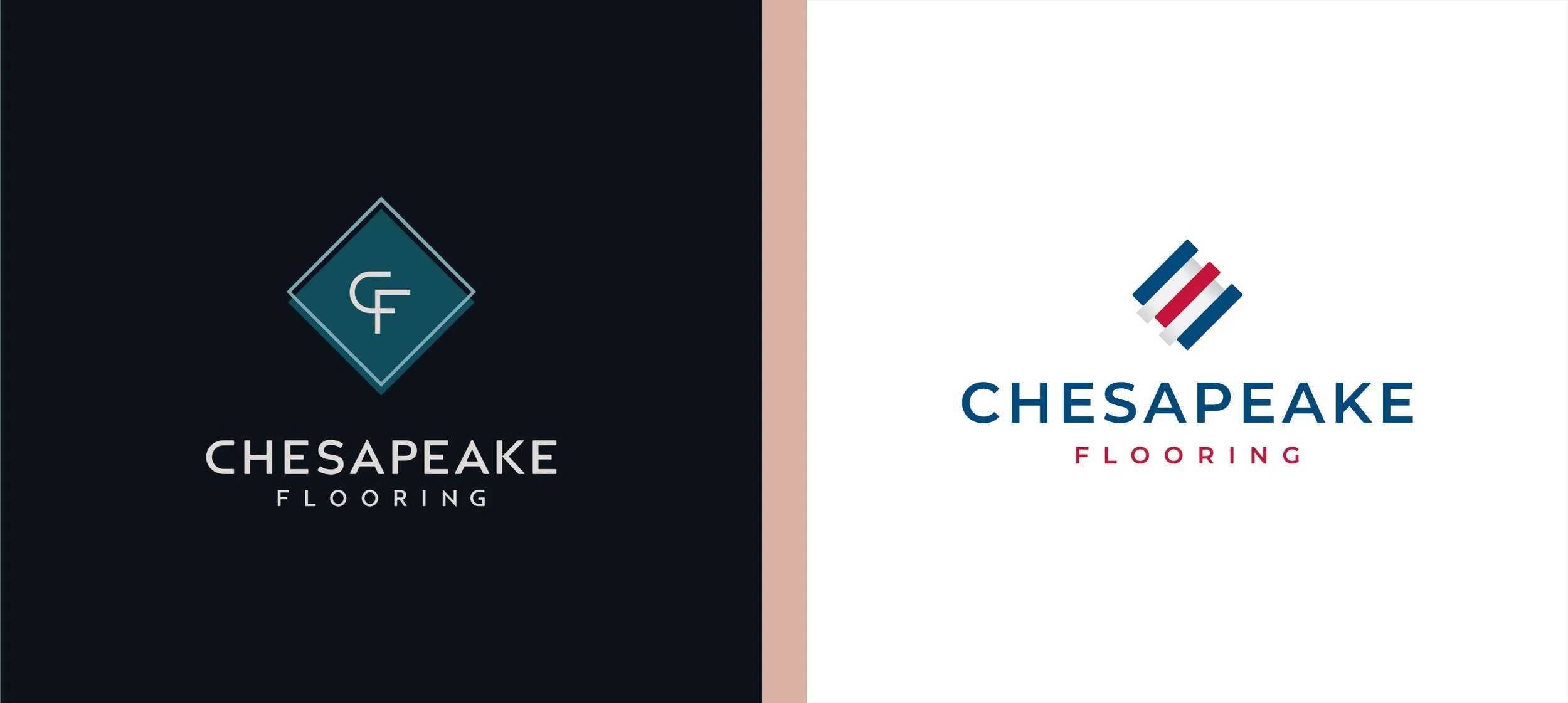
The client decided to move forward with the more traditional look, so I got to work building out the full brand system. The nautical flag motif gave us a rich set of colors but could be read as patriotic, so I tempered them with a soft, marshland color scheme that kept the focus on the bay environment. The logotype was a minimal sans serif treatment for easy readability but could skew modern, so I incorporated a secondary serif typeface with playful details like ball ligatures to reinforce the brand’s heritage without feeling snooty.
THE CHALLENGE:
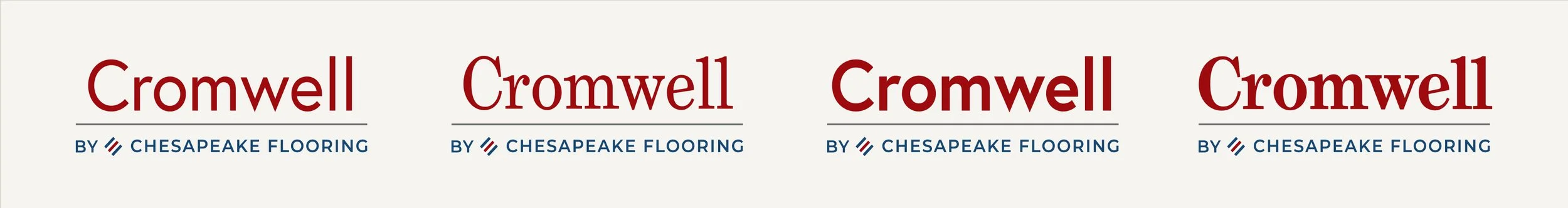
The flooring industry is unique in that some product lines can be positioned as brands, with recognizable logos distinct from their parent brand. Chesapeake required a logo system that was flexible and expandable, yet recognizable.
As a designer, I’m often cautious about providing clients with materials intended for them to customize; even the most seemingly foolproof setup can present unexpected results that damage the brand’s visual consistency. In this case, an editable system was unavoidable, so my focus became creating a method with enough choices and editing points to be effective, but not so many that the creations could become garish.
To do this, I created a new logo lockup that highlighted an editable 1-2 word product collection name, while still referencing the parent company brand in a minimal way. The product initiative team would then have four styles to choose from when creating their new brand:
A modern and graceful look, featuring a lightweight sans serif
A modern and bold look, featuring a thick sans serif
A traditional and refined look, featuring a lightweight serif
A traditional and strong look, featuring a thick serif
These options would allow the team to communicate the style of the product and appeal to its intended audience, without allowing them to reinvent the wheel for every new launch. The overall look and feel of these was intentionally consistent; after many products were launched, the system’s unified style would become a recognizable part of the Chesapeake brand.
THE CHALLENGE:
Though contractors are primarily concerned with reliable access to the popular materials requested by clients, homeowners need the brand to be a proven trend setter that can guide them through this expensive style decision.
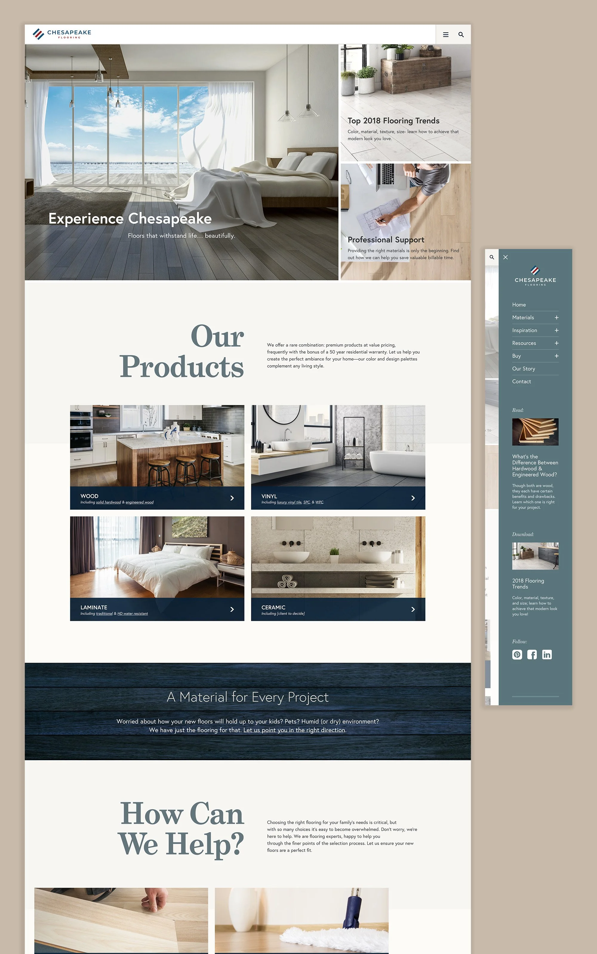
As most homeowners will only replace their flooring a few times throughout their lifetimes, they need added support when selecting a product with which they are otherwise unfamiliar. Chesapeake had to move away from only utilitarian product listings to implementing a sustainable plan for long term inspiration-focused and education-based content. With this in mind, I created a new site architecture that proposed:
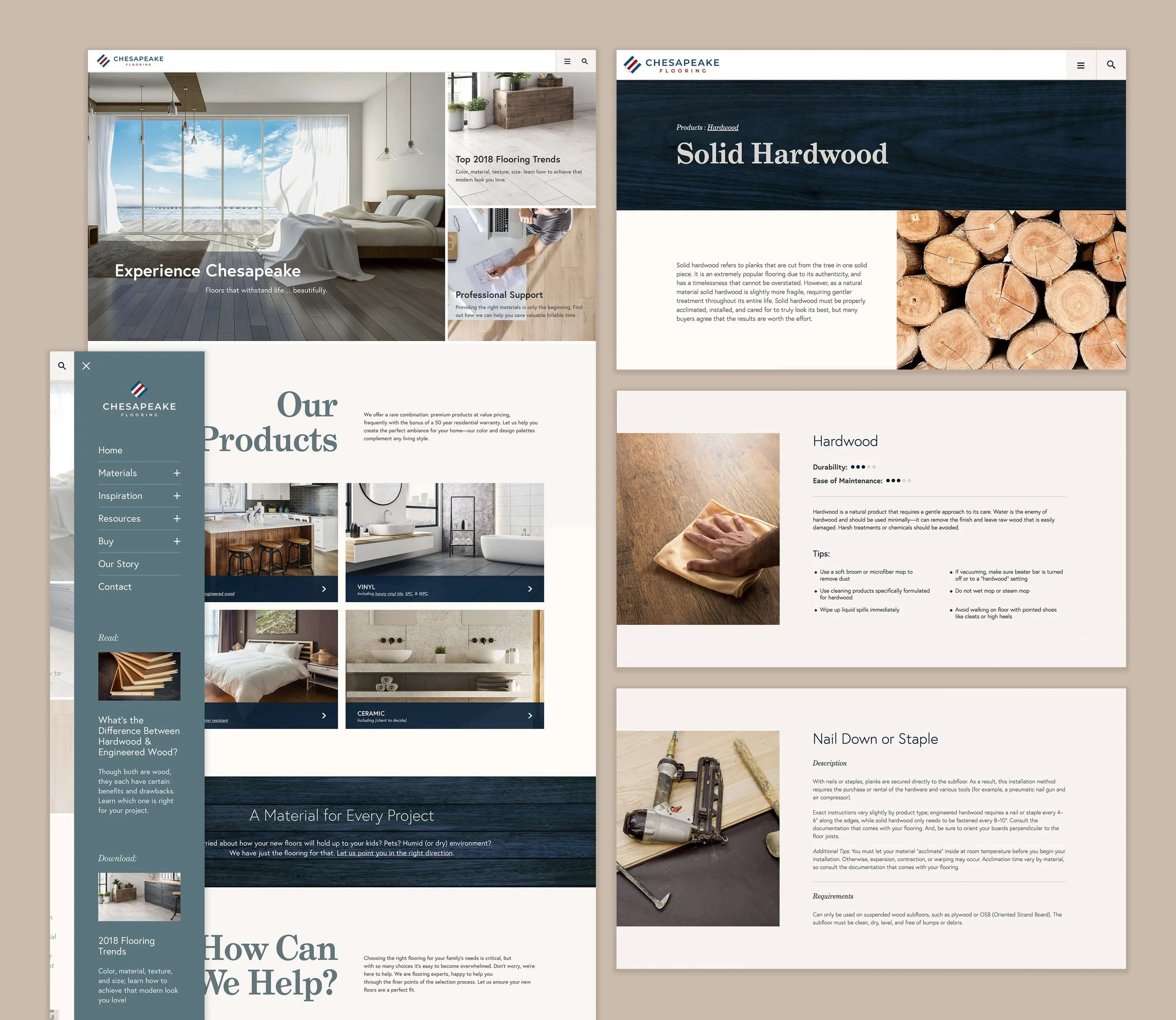
Evergreen reference content that was approachable for beginners, so users could learn how to install and care for their products
A blog series dedicated to style forecasts
A blog series discussing basic aspects of flooring and installation
Interactive elements, social media integration, and downloadable materials
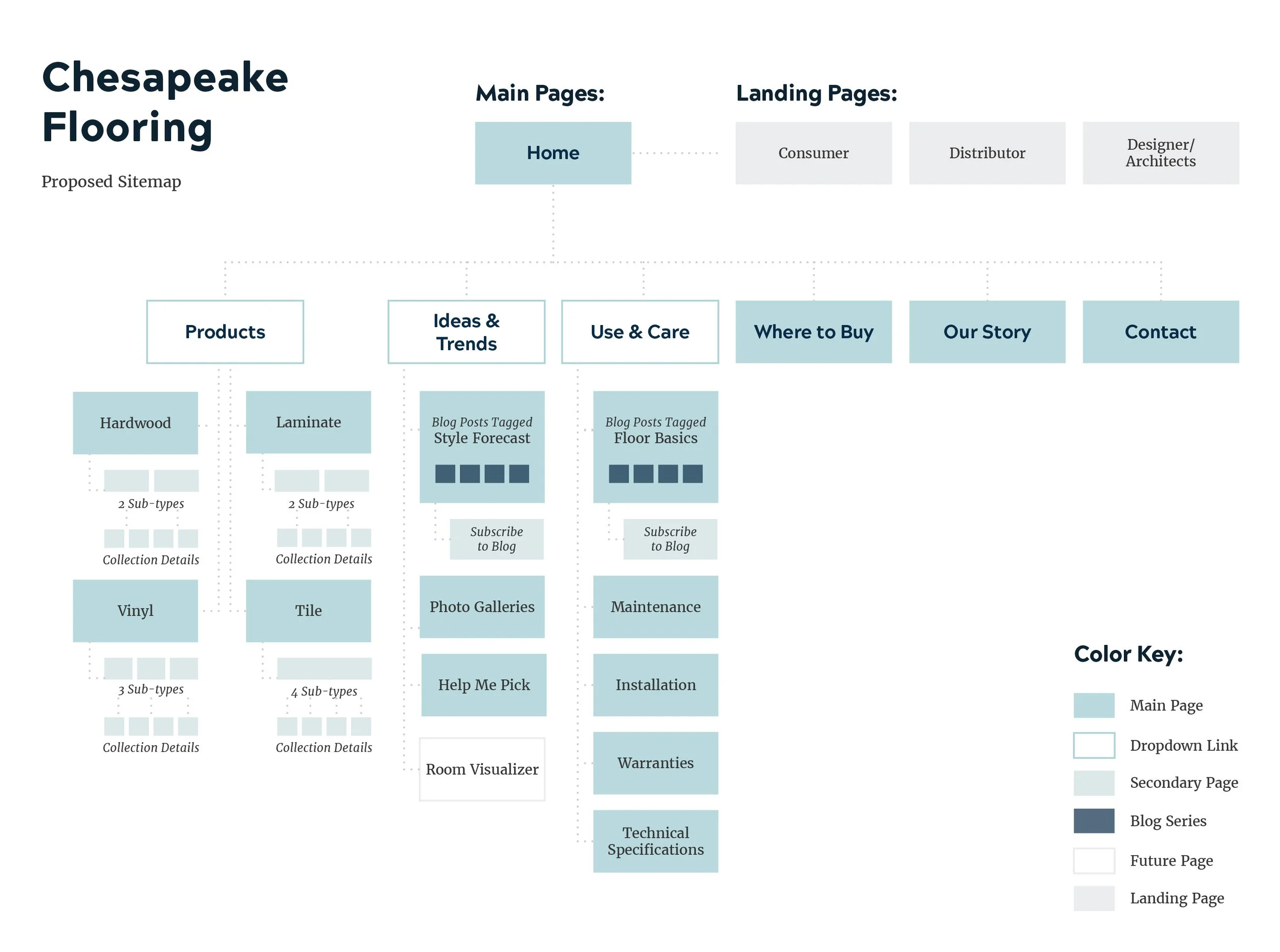
To support this content, I designed a light and airy website UI that would allow Chesapeake’s messaging and materials to shine. Minimalist grids, ample whitespace, warm photography, and the use of slightly rustic textures created a soothing ambiance, while areas of deep contrast created subtle tension and visual interest. Simple layouts ensured that users were never overloaded with complex information, and clear click paths in both the mobile-style navigation and the page structures helped users to drill down and find exactly the information they needed.
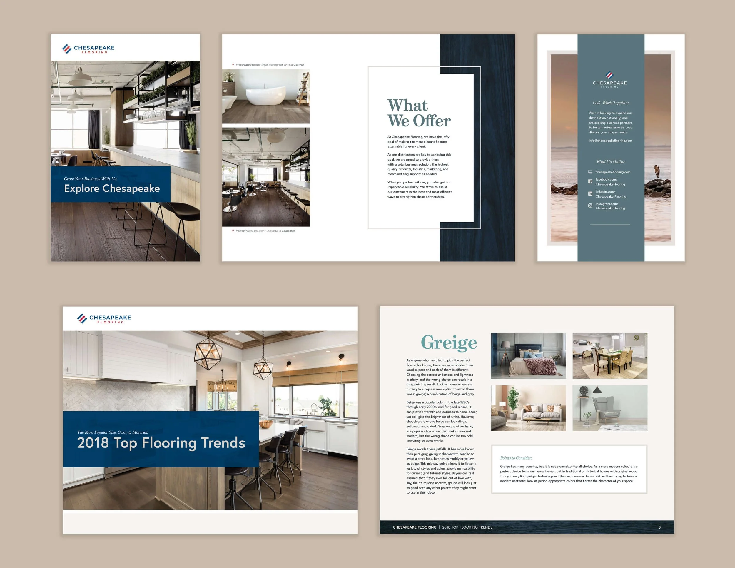
With so many planned locations on the site for these new materials to populate automatically, content creation became a critical piece of the web strategy. The client needed to understand how these items would function as part of a larger marketing strategy, so I wrote and designed several samples of each type of content, including:
Downloadable guides offered as gated content, to build Chesapeake’s lead database
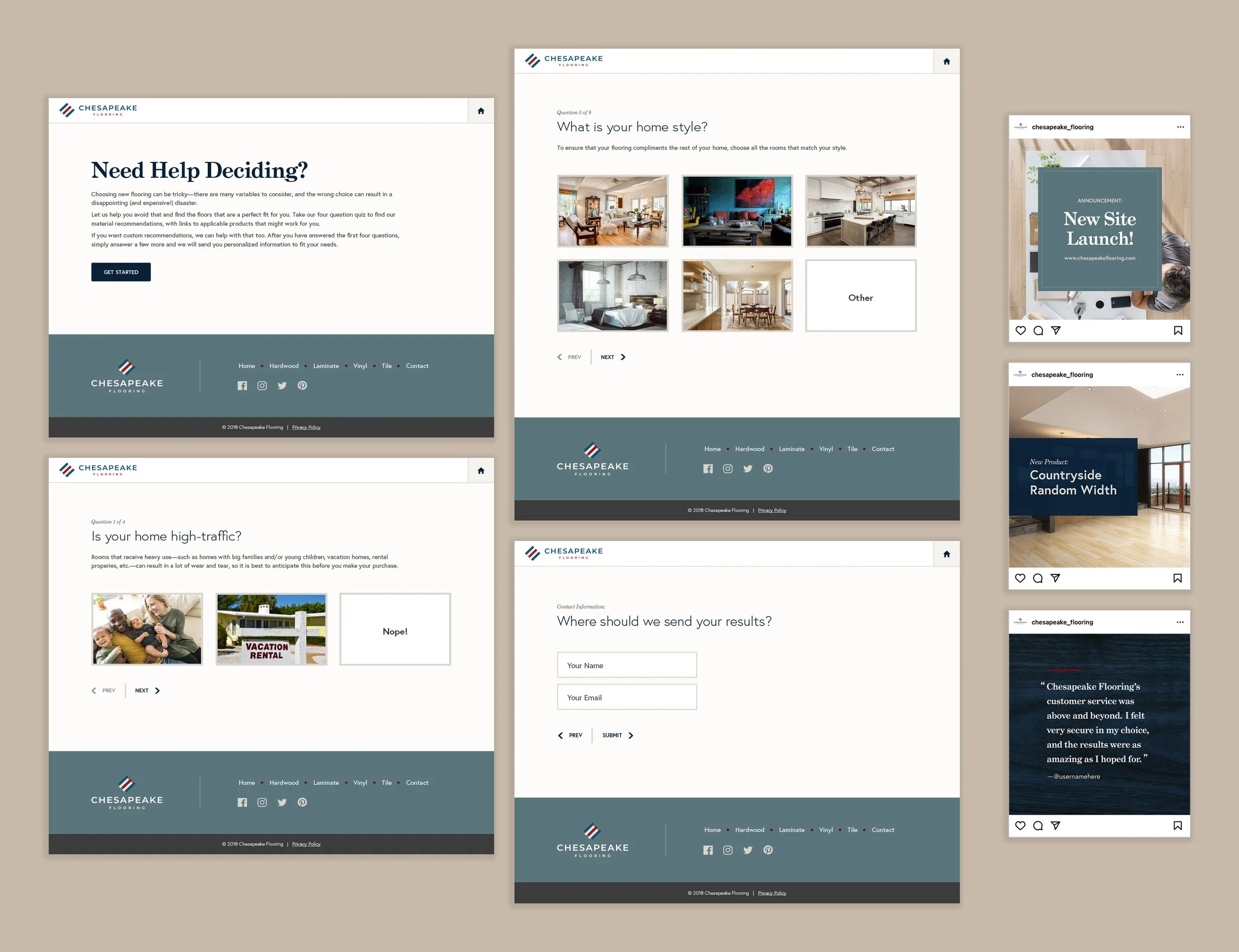
A chooser quiz to collect data on customer preferences and needs
Social media templates and a custom hashtag campaign, for collecting real inspiration imagery from clients
THE CHALLENGE:
Web browsing was a critical new first step in the sales process for the homeowner audience, but deep-funnel SQLs of all types would still inevitably need easy access to actual products before completing the sale.
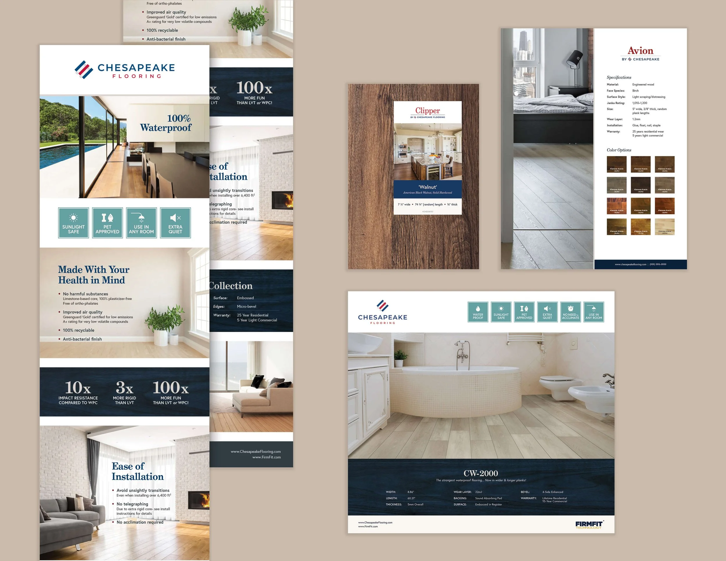
To ensure that the transition from digital to physical felt cohesive, Chesapeake also opted to update its display and labeling systems to match the new brand direction. I worked with their team to review material samples, completed a variety of discovery work in real storefronts, then redesigned their display posters, sell sheet placards, box labels, board stickers, and more. I also developed a series of product feature stamps and used them consistently across all physical materials to create a recognizable pattern across products.
Lastly, we took a close look at the transition point at which each audience switched from information-gathering to sales, to ensure that their needs were covered and this step could be accomplished as smoothly as possible:
To support contractors at trade shows, we developed a series of takeaway documents that provided technical information, trade pricing information, and next steps
To help homeowners locate a supplier for purchase, we leveraged Chesapeake’s database to provide an up-to-date, customizable map charting nearby options