APHL
SCOPE
Website redesign
MY ROLE
Usability research, UX strategy, UI design
MY DELIVERABLES
Reports, wireframes, web interface, annotations
CONTRIBUTORS
Aline Lin, creative director
Steven Portas, front end developer
Joseph Parsley, back end developer
Jessica Stephens, project manager
Tara Kelly, project manager
TOOLS
Figma
In the United States, governmental health laboratories are a key part of an efficient response to disease outbreaks, natural disasters, chemical spills, and other health emergencies. APHL, the Association of Public Health Laboratories, supports labs at the federal, state, and local level by providing training, research, publications, and conferences to keep laboratory scientists educated and informed.
To effectively serve its members, APHL must provide an enormous amount of information to many different audiences. As a result, its site contains hundreds of pages that are largely manually maintained by APHL staff, with very restrictive templates that make content presentation less than ideal. The sheer volume of pages have also led to a confusing navigation system that makes it difficult to locate information. APHL hired our team to conduct user research, then completely reimagine the site’s organization, CMS functionality, & design.
THE CHALLENGE:
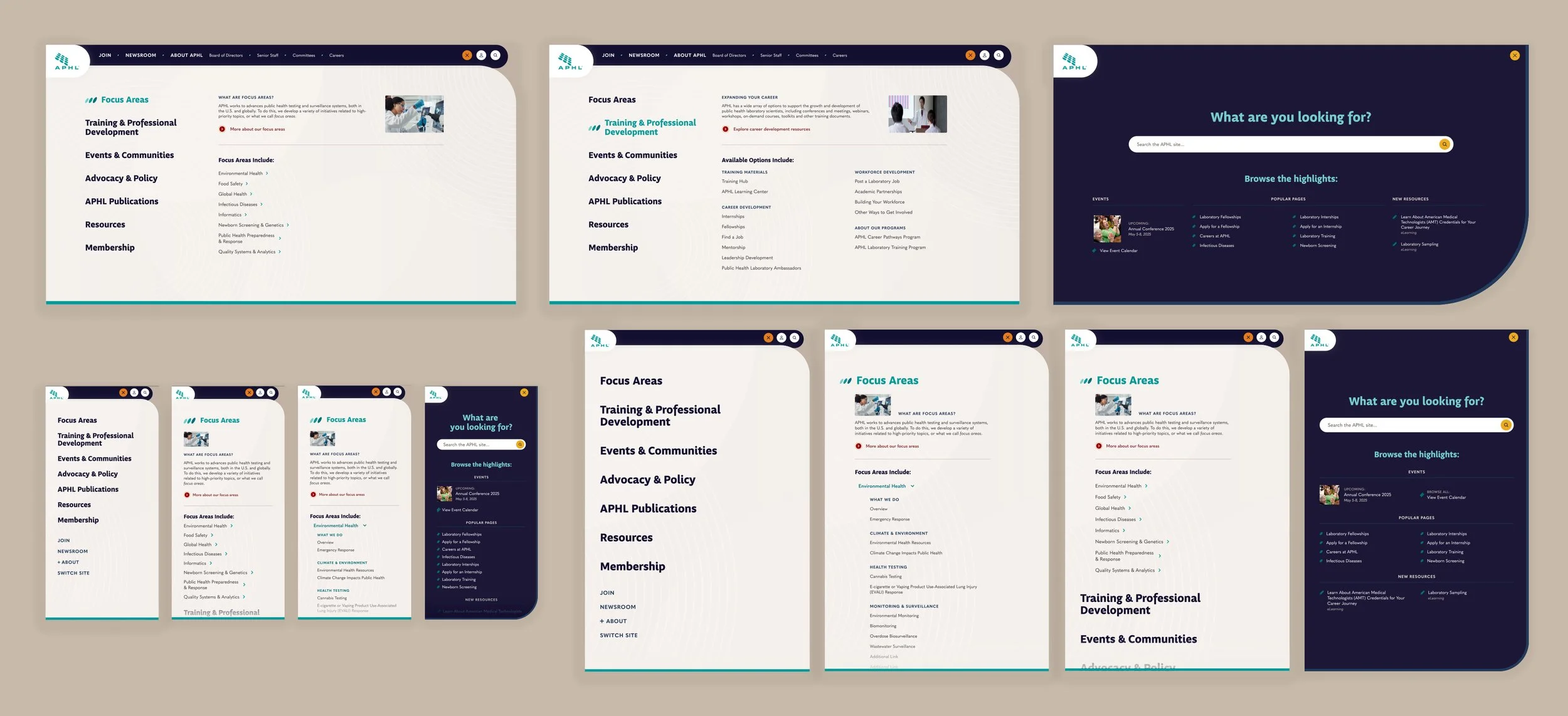
In an attempt to group its volume of materials, APHL accidentally created navigation that was too vague to be useful. Its structure required too much prior knowledge of APHL, and as content could often fit into multiple categories, many links were duplicated in several areas.
But the key flaw in APHL’s previous navigation system was its high-level approach. Likely in an effort to avoid overwhelming the user, all content was divided between only 5 top-level choices. Each of these areas then contained several dozen links, which necessitated less specific navigation labels be used in order to accurately describe the contents. The result was a system that was difficult to navigate, even for expert-level site users.
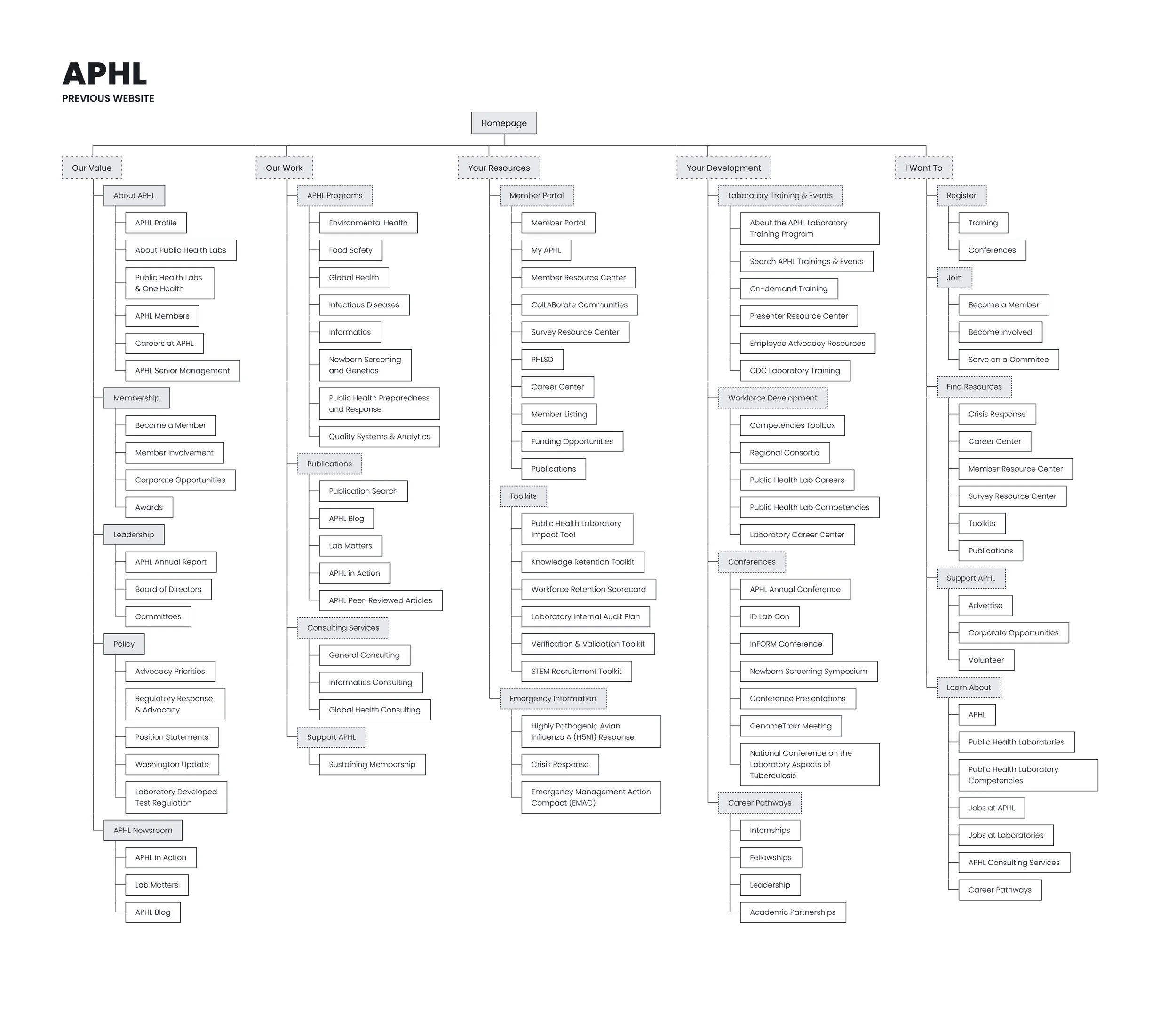
To learn how users understand its content, I conducted two card sort exercises and a tree test exercise with APHL members. Both card sort tests were open, with test #1 focusing on grouping and naming tier 3 pages, then test #2 focusing on grouping the results of the first test into navigation labels. Unsurprisingly, members eschewed the current division in favor of more traditional and direct label language; the majority of the site had very clear associations, with only a few areas in which a consensus could not be reached. I updated the information architecture using this data to feature seven navigation categories and a much more abbreviated list of choices.
To confirm these findings, I then conducted a tree test with a third set of APHL members. The results were positive: 5 of 8 tasks had a successful completion rate of 75% or higher, with an additional 2 tasks indicating an issue in page naming conventions, not the organization itself. Only one task reliably failed, with 2 of 3 users incorrectly anticipating that the page would be in another area; this was addressed in the final information architecture.
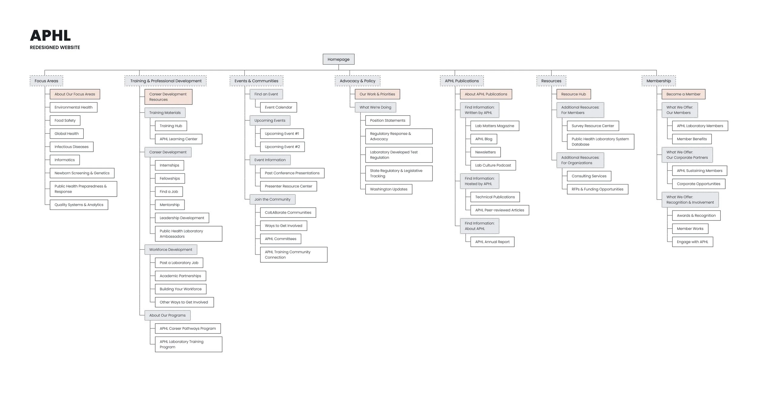
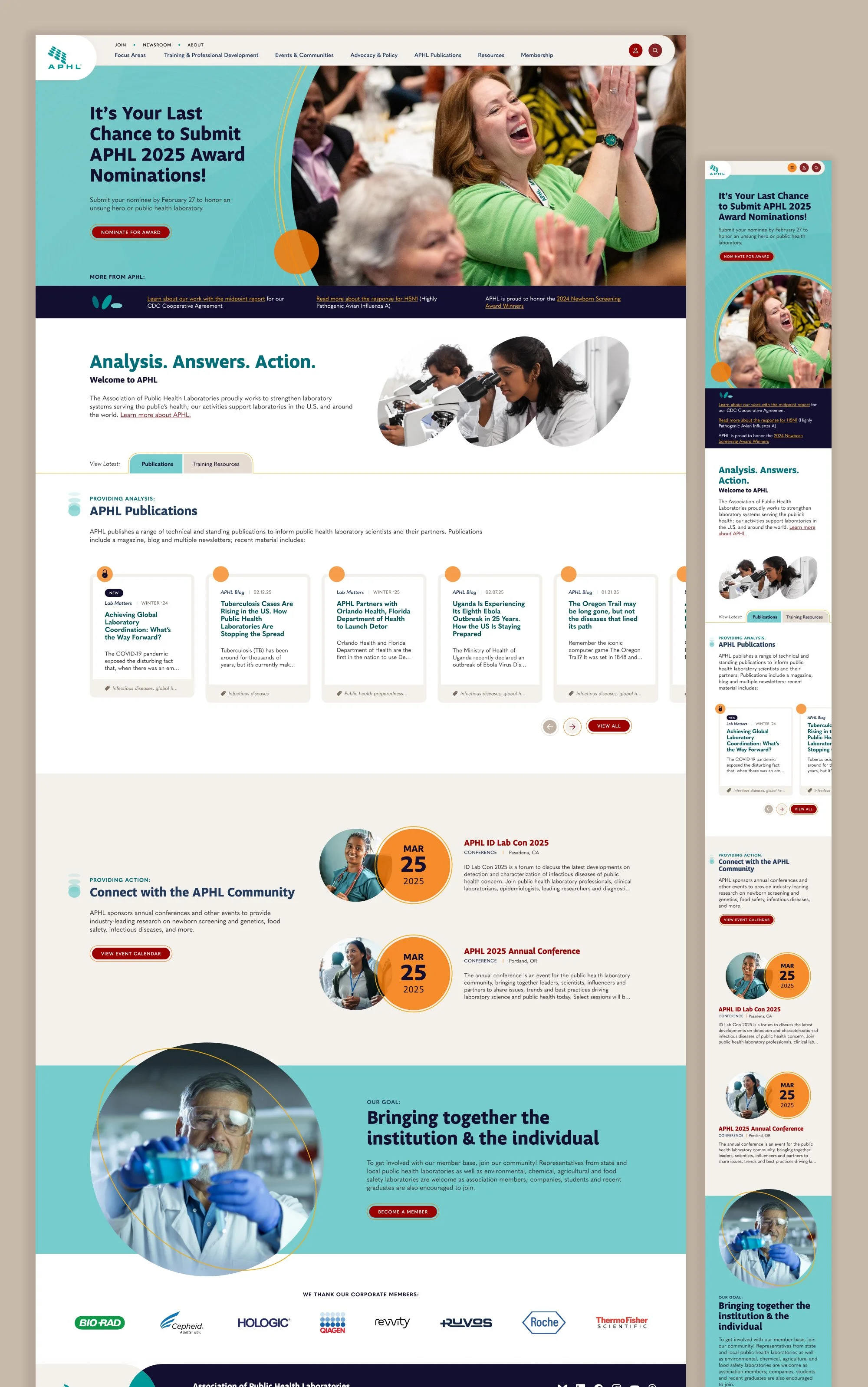
To support this strategy, I then designed a navigation system that would visually guide users to their required content. Using a mega menu structure, I created an area for introductory language and a single featured link, providing contextual support for new visitors. The remaining links were displayed in a simple two-column structure, with two layers of helpful language in the sub-category labels. This structure gracefully collapsed on mobile and tablet devices, offering users a less overwhelming first impression.
THE CHALLENGE:
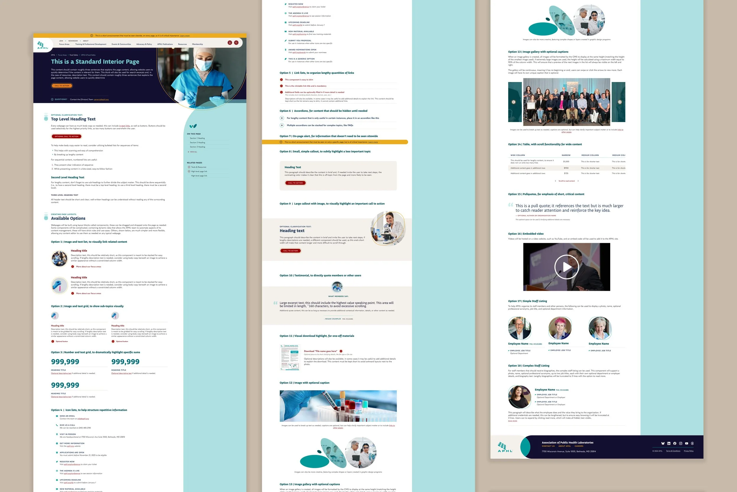
APHL has a huge amount of material, and its website was very restrictive in the available content presentation options. Pages were typically highly templated with few customization choices, making all pages look visually similar and forcing content into a less than ideal structure.
To provide the client much more flexibility, I coached them through implementing a component-based system across the majority of their site. To do this, I created a series of layout building blocks that could then be added to a webpage in any desired order and combination. This included:
Blocks containing an image with text, organized into grids, lists, and callouts
Blocks to organize links in a more interesting way, such as stacked or with an accompanying visual
Blocks for specialized content, such as icons, employee headshots, and testimonials
In total, the new APHL site will hold 18 plain text components, allowing for a wide array of page layouts to be created. To aid the client in communicating this change with their team, I then designed a ‘menu’ type of mockup- rather than utilizing existing page content, it instead lists all the available options and explains when each should be used, so content editors can see their choices in context and plan accordingly.
THE CHALLENGE:
Much of the APHL site required flexibility in approach, but several specialized content types were being manually entered and edited by APHL team members. This resulted in a content maintenance burden, inconsistency of materials, and difficulty in disseminating this content across the site.
EVENTS
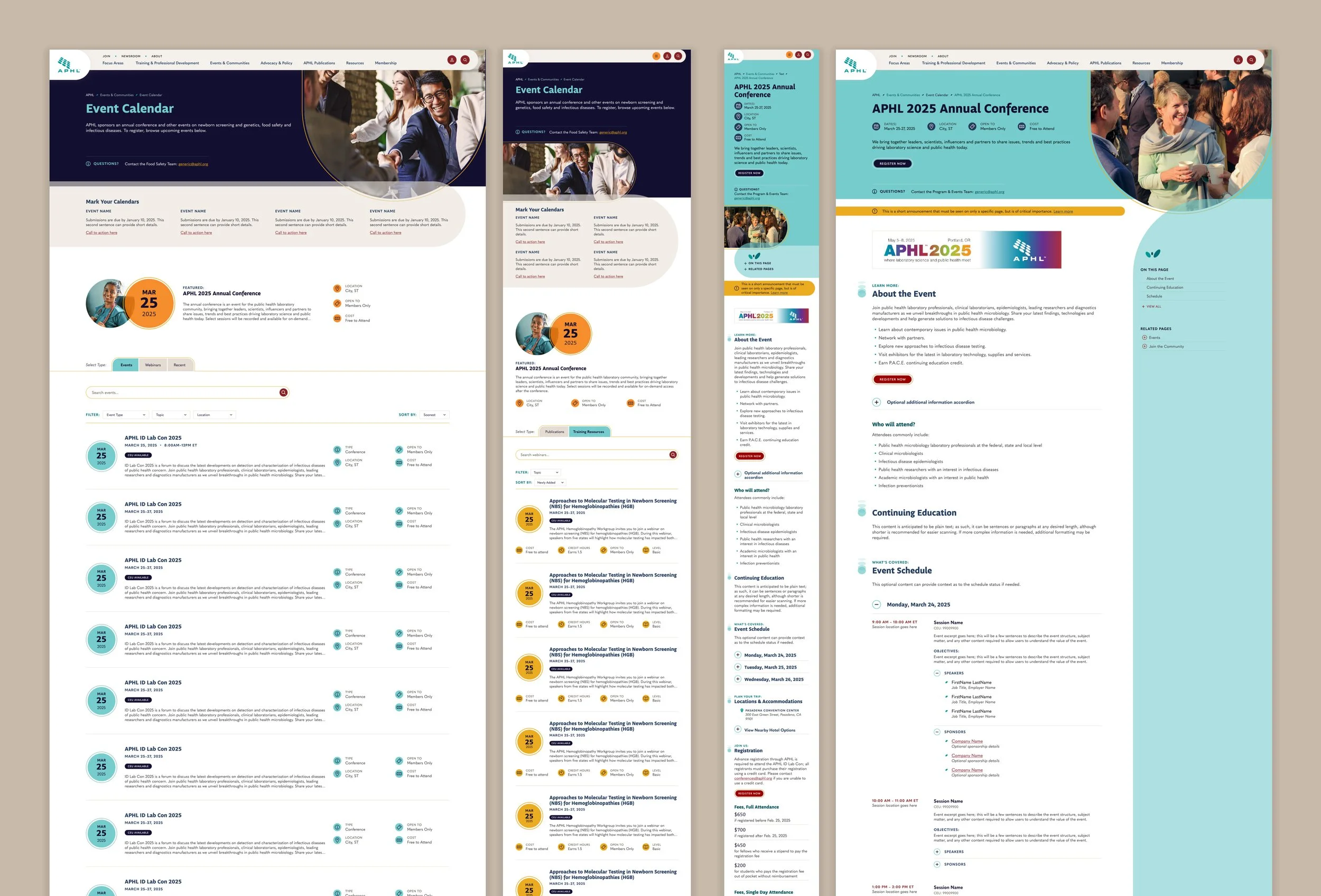
APHL hosts a wide variety of in-person and events for its members, but previously did not utilize an event platform or calendar to do so. As a result, all event content was updated by hand and risked becoming out of date if team members were not exceedingly prompt. In addition, the lack of calendar-based functionality meant that users had to already be familiar with the event in question, or be willing to do additional research while browsing to identify upcoming events.
To bring consistency across events, I created a robust event page template that included all relevant information an event might need, but could degrade gracefully if smaller events did not require every single field. Content was organized with dedicated specialty components, including an event schedule for complex itineraries.
Each event’s data included a type tag, topic tag(s), a location, and a date range. These were then used to automatically create an event calendar, which used this data for sorting and filtering. The calendar also pulled in content from APHL’s LMS system and contained an archive record of past events.
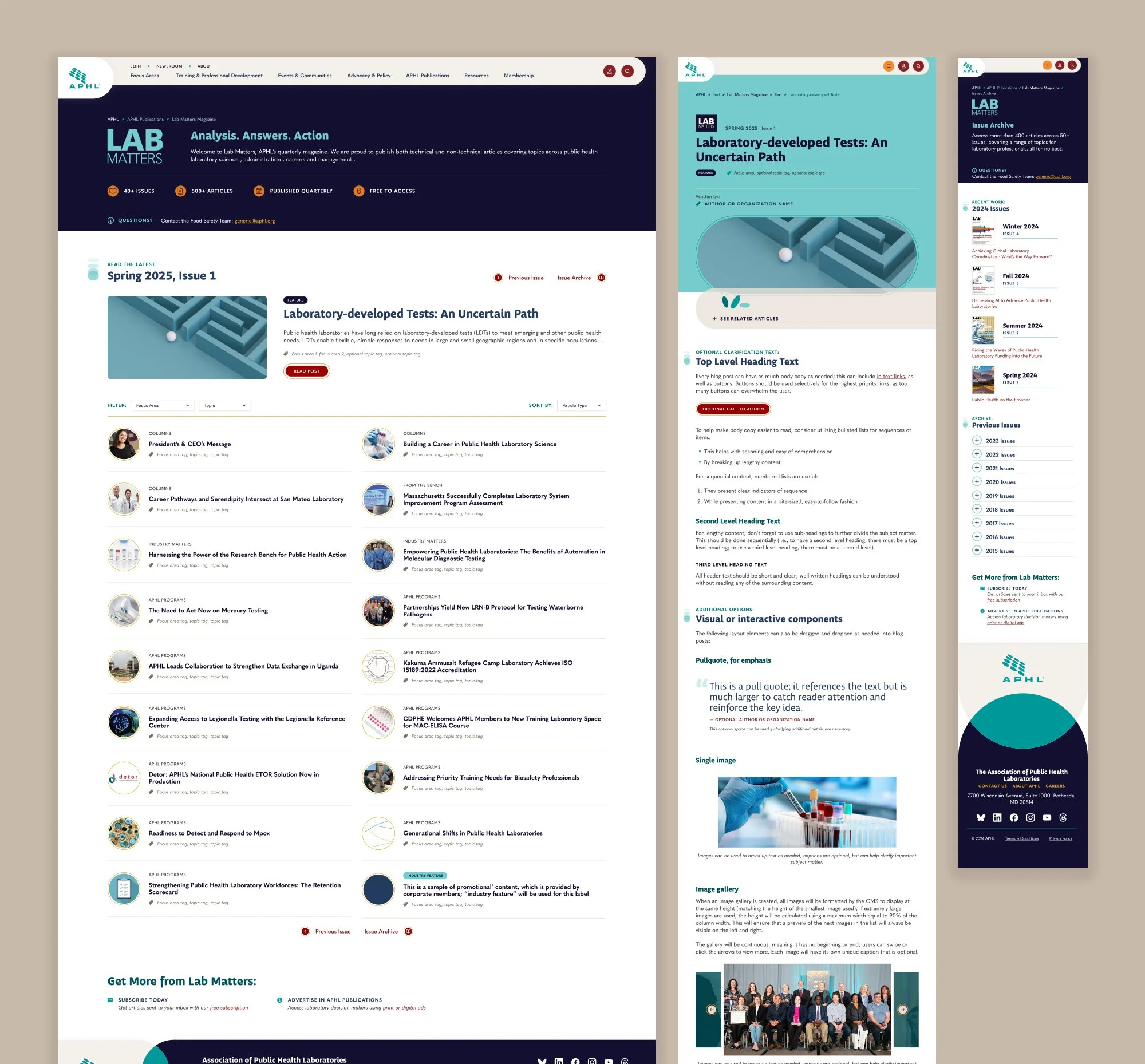
PUBLICATIONS
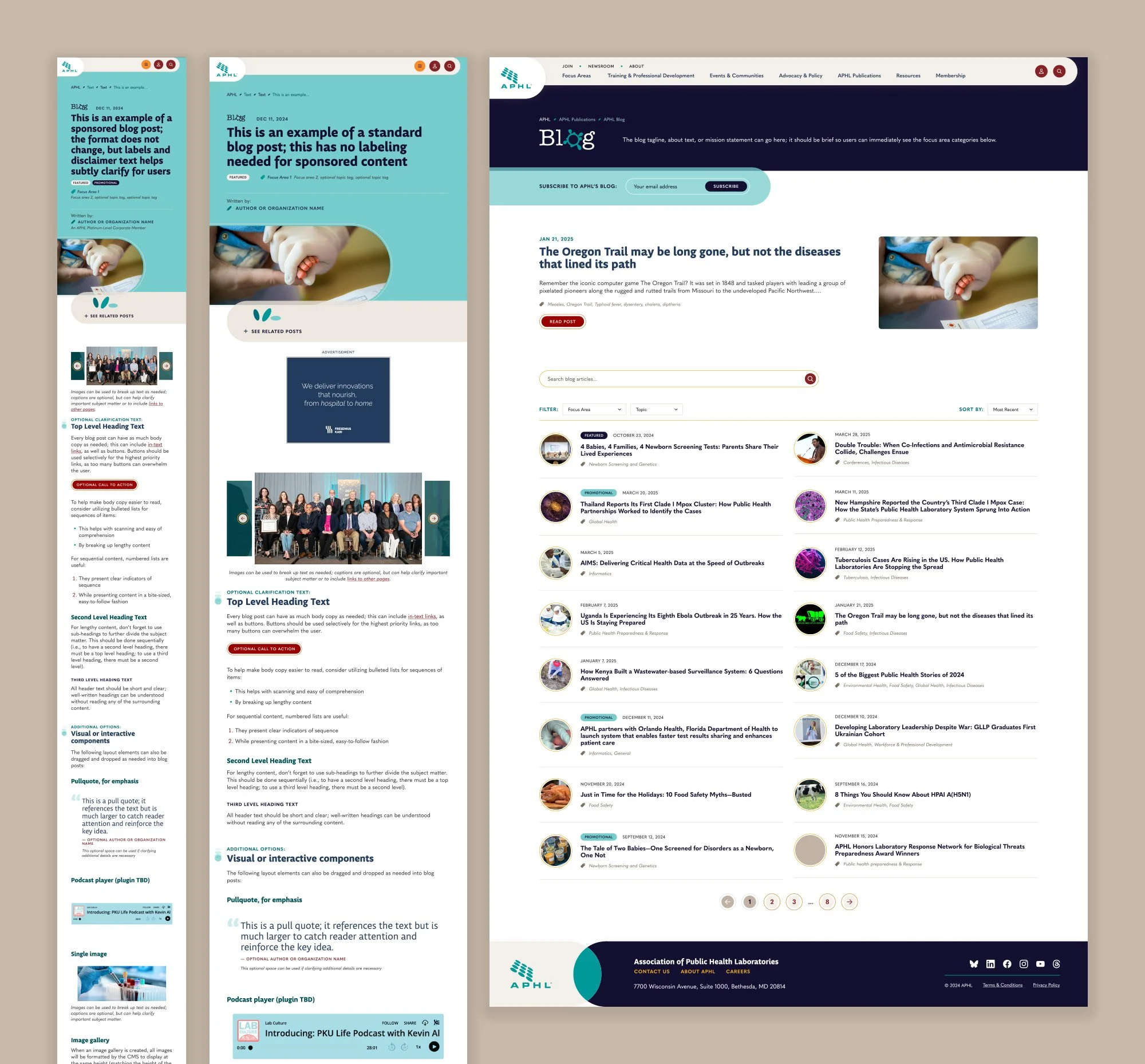
Between its blog and its magazine, Lab Matters, APHL hosts an inordinate number of articles. Previously, these were sectioned off in another site or only available as PDFs, reducing how discoverable this content was; there was no way for content editors to embed it in related pages, and often even cross-linking was difficult because of static and print content.
To remedy this, I created templates for both publication’s materials, including support for various scenarios (advertising, featured posts, multiple authors, etc.). These templates both utilized a strict data structure, including article publication details and a robust tag system. This data was used to automatically cross-populate related articles and to create resource collections (discussed below).
Finally, both publications received index and archive pages. Each index page had to allow for the unique requirements based upon their release structure: blog posts did not have a strict cadence or reading order, while the magazine was released quarterly with a sequential table of contents. Both areas utilized automation as much as possible to build the index, reducing the content entry workload.
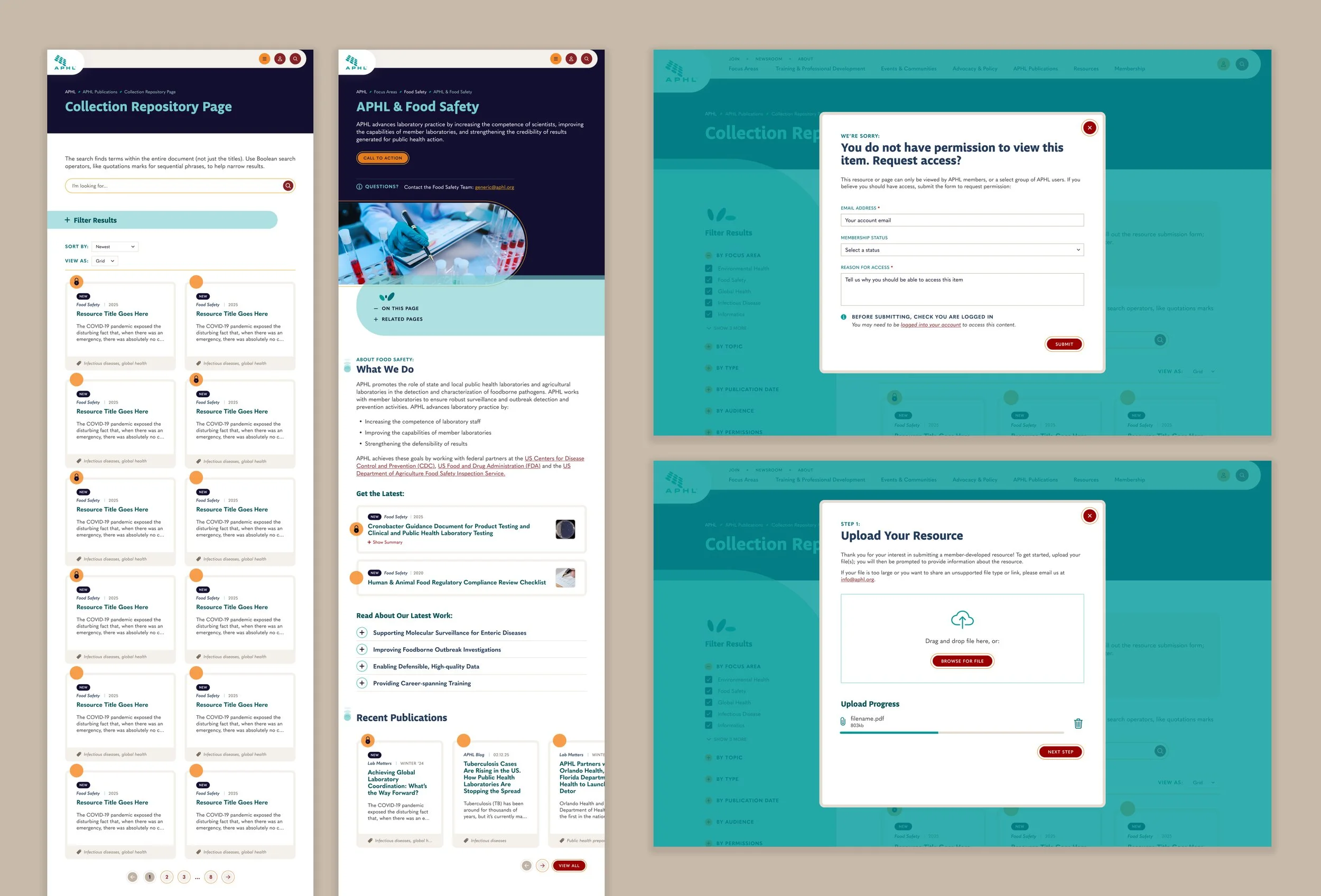
RESOURCES
In addition to articles, the APHL site hosts a huge mass of resources: guidance documentation, training material, downloadable templates, reports, and more. These were previously added to pages haphazardly as plain text links, with no way to maintain them outside of those individual webpages.
The new APHL site has a resource content type that includes these files, blog posts, and Lab Matters articles. All instances are tagged with a variety of data, including format, topic, publication date, and more. They are then displayed as cards, which can then be placed on the site in several ways:
As a collection with a webpage dedicated to only that collection, featuring robust filtering
As a slider embedded within another page, to supplement that page’s content
As a standalone single resource, to supplement another page’s content
All presentation methods offer customization options, including manual selection vs automatic population, sort mechanisms, and more. Because all resources are tied back to that central content type, editing, updating, or deleting the parent resource will apply the change to all instances sitewide.
MEMBER FUNCTIONALITY
One key benefit of APHL membership is the expanded access to additional research materials. These permission levels can be quite granular; even employees within the same laboratory may use different resources. To make this clear for the user, all components with permission requirements feature the same circle & lock icon to provide a visual cue of what is or is not available. If the user does not have permission, clicking locked content will cause the CMS to open a popup explaining the issue and inviting the member to request access. If the user does have access, the CMS will instead display a callout on the page inviting the user to contribute their own materials for APHL approval.
To track the complex data and functionality across the APHL site, I wrote extensive technical requirement documentation. This was provided to the client for review and revision, then passed along to the programming team to guide the back-end development process.
THE CHALLENGE:
APHL did have a branding system, but its current site did not do a good job at utilizing it, nor at creating a visual style that would communicate its values to its members.
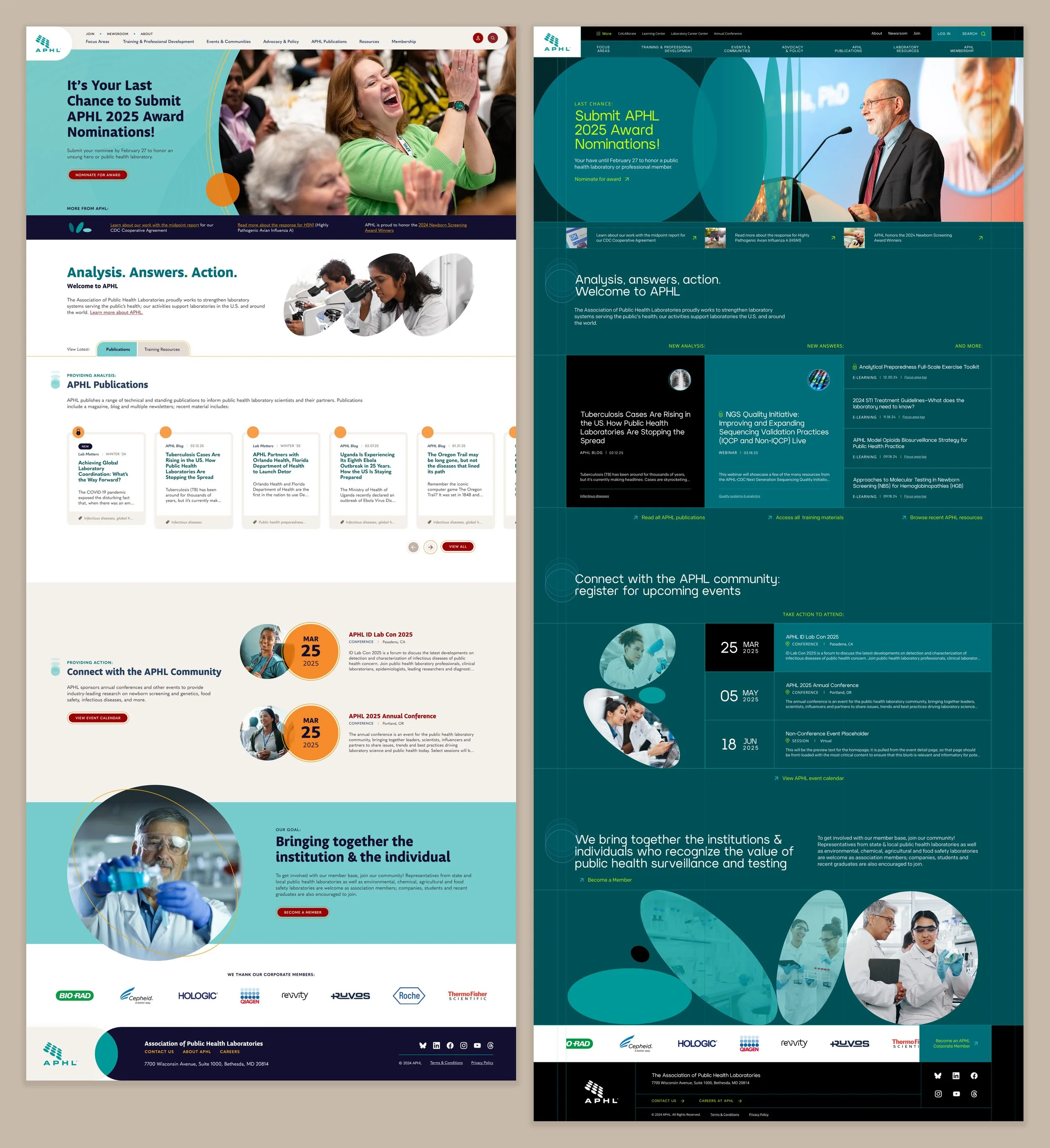
I began the design phase by creating two different visual concepts. The goal of this exercise was to demonstrate to the client that the exact same content could be styled in such a way as to give radically different impressions about the organization, and get them thinking about how they wanted APHL to be perceived. The first option used softer shades, warmer photography, informal typefaces, and layered circular elements to create a friendly and welcoming impression. This first concept was intended to be a safe choice, whereas the second one intentionally pushed the limits of the brand; it became my personal favorite of the two options. It utilized a deep, high contrast color scheme with neon accents, dramatic concentric circle imagery, a visibly gridded structure, and more modern and ‘tech-y’ typefaces to highlight the cutting edge nature of APHL’s work.
Upon seeing these concepts, the APHL team immediately understood the decision that they had to make and conferred as an organization. Ultimately, they selected the friendlier design concept, which I expanded upon across the rest of the site. Consistently utilizing rounded corners, layered semi-transparent overlapping shapes, and warmer tones helped every page feel welcoming and accessible to site visitors while still guiding the eye. At the client’s request, I also utilized some of the smaller details from concept 2, such as the concentric imagery and echoing shape motifs. The result is an entirely new look for the APHL site that the organization can continue utilizing across their other materials.